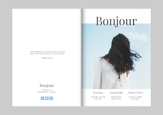
There are 4 files here, 2 mock-up spreads per file, with the front and back covers on the 4th file. These PDF submissions will display the best quality, accurate to how they were designed. These files will each require scrolling down to see all the content.
This is a view of the designs in their original form, not placed on a mock-up. Aside from any issues on the part of InDesign handling some Photoshop-created imagery, this is the full resolution for the final piece. Most of these files will each require scrolling down to see all content.
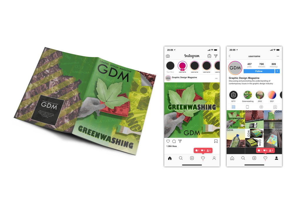
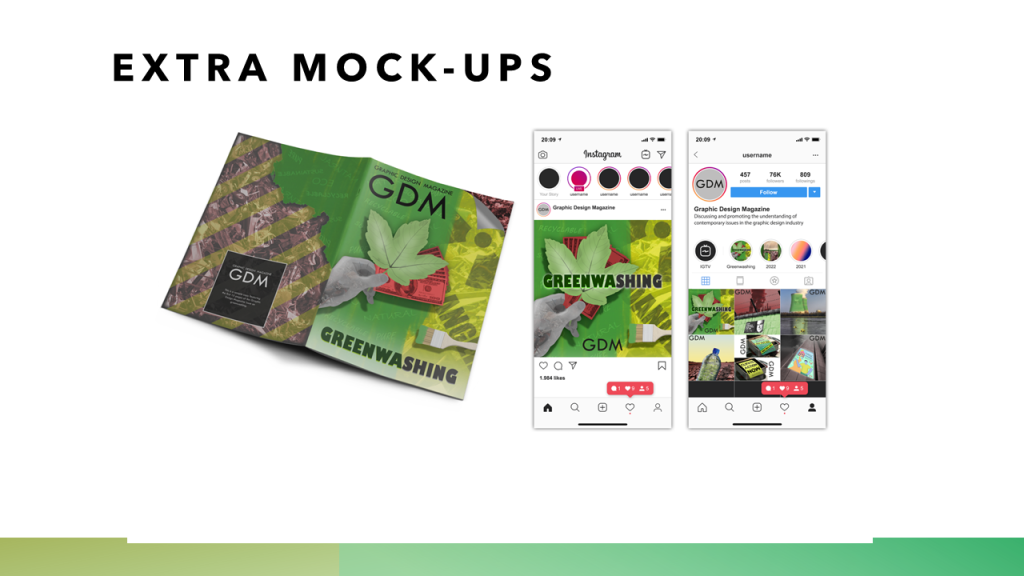
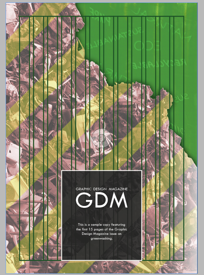
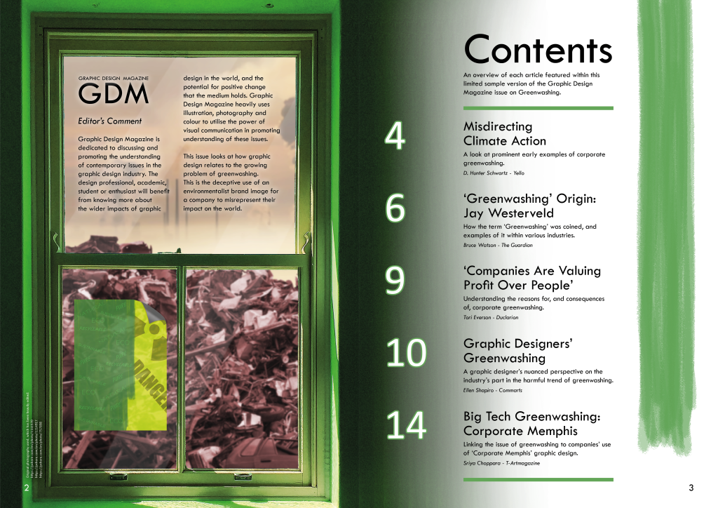
This mock-up shows a view of the front and back covers together. It also shows what some of the content would look like on a proposed ‘Graphic Design Magazine’ Instagram page.
These are the same mock-up spreads as featured further up in PDF form. Please refer to the PDF submissions above. These PNG submissions suffer from WordPress compression limitations, and will appear pixilated to some extent.
I took some steps to manage my time keeping from the outset of this project, though it could have been better. A production schedule was created where I identified everything that would be required to work towards this brief effectively, which I was able to refer to a few times. However, especially towards the start of the project, the very long time allocated to this project did mean there were times where my work slowed down, as there was no concern for running out of time. I was able to step up the amount of work I did further into the project, however, particularly in the final few weeks. I always had the deadline clear in my head, and knew that I would be more productive closer to the deadline, so overall my time keeping was not a major issue in this project. I took extra time towards the start of the project to do general research, which was useful, and done with the security of knowing when the ultimate deadline would be.
How was my analysis of the brief?
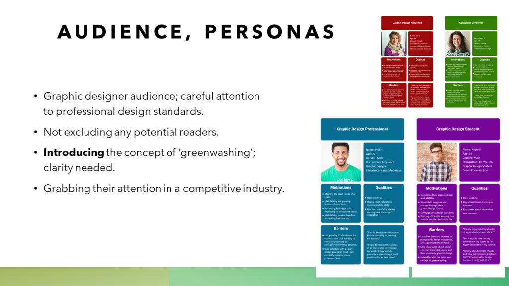
The project brief was self-initiated, a proposal which was then confirmed to be my brief to work towards. I put care into making sure the brief was in a direction that would be useful for my design practice, was building off my existing research and provided interesting opportunities for further research, and had deliverables that would certainly be achievable. I was able to refer back to the brief as the project went on, to ground the direction of my work to always know what would be appropriate and effective for the proposed client, message and audience. I expanded on the brief through research based on the message of the brief, and created personas in line with what was outlined as the audience in the brief.
How was my research? How did I draw conclusions from it and use it to inform idea generation and development?
My research was firstly built on my previous dissertation research. The concept of greenwashing was something I had significant familiarity with going into this project, which was very useful for being able to set out a proposal and work towards it in an appropriate way.
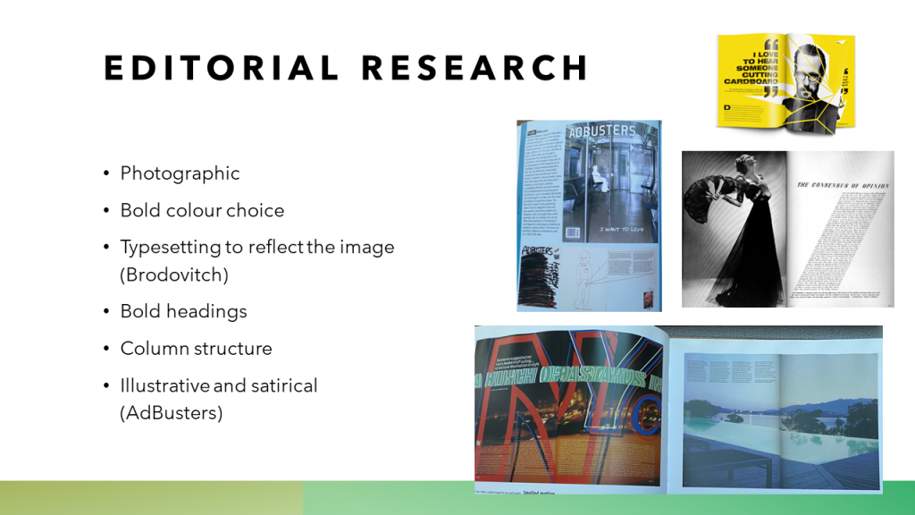
I continued with extensive research when the proposal for this project was in place. Much of my early research focused on expanding my knowledge of editorial design. I paid attention to professional views on this type of graphic design, and looked at many different examples of covers and inside spreads to consider what works about such professional examples, taking on visual inspiration in a way that stays relevant to my brief and doesn’t copy any existing designs closely. I also discovered new adjacent areas of research which expanded my view of the greenwashing issue, such as Corporate Memphis. I also looked at the satirical response that editorial companies have taken to similar issues, such as that of AdBusters. These fed into the ideas I generated on what text content I could include, and the visual approach I could take to visualising each text.
Selecting existing texts on the topic was also a result of extensive research, as I build up an overview of how greenwashing is relevant to the graphic design industry, and then hand-selected texts that effectively introduce greenwashing and this connection to audiences. I visually researched specific topics that appear in each of the articles; taking this research was crucial to deciding what might appear on each spread.
How did I use evaluations to help with my ideas generation and development?
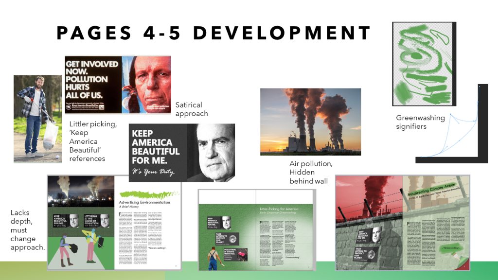
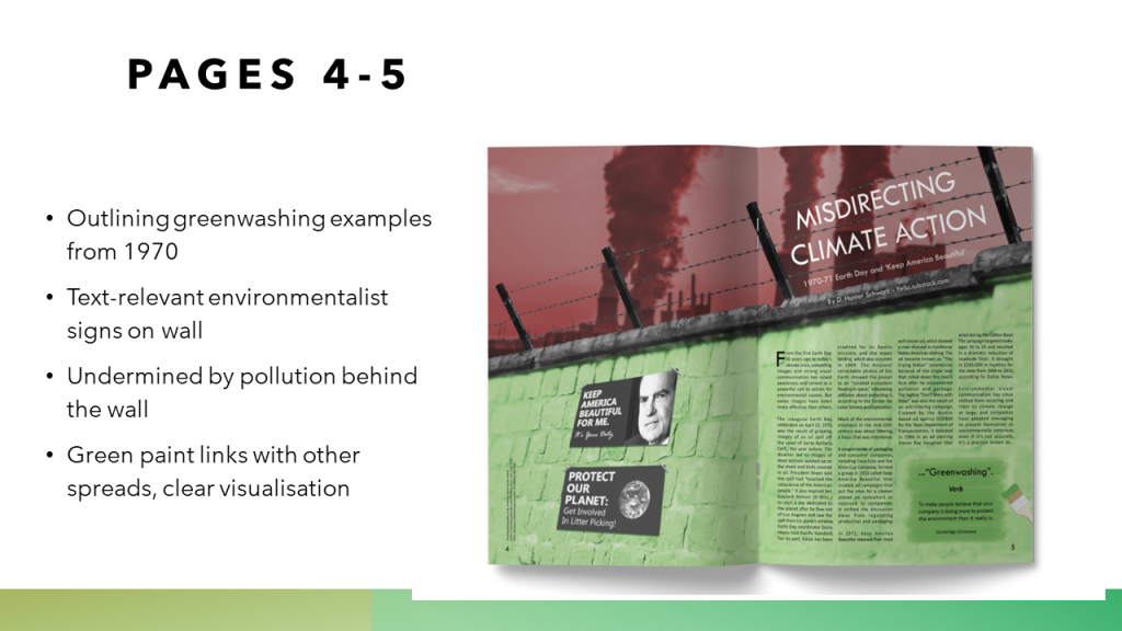
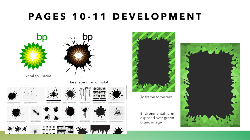
Extensive written evaluations of my work were essential in developing and improving it. As I began to create designs based on my secure body of research, there were many instances that my initial developments for the design seemed not to be visually effective. It is not always immediately clear why a design might not be working. To address this, it was important to step back and take a critical eye on my work, evaluating which aspects are and are not working, and shifting my approach according to what I find in my evaluations. For example, the ‘Misdirecting Climate Action’ spread started with a full-page illustration which incorporated the Corporate Memphis style to visualise a well-researched aspect of the text. As I proceeded with this, it was clear that my approach was not working, despite some solid initial justification for taking this approach based on my research. It wasn’t until I halted my designing to evaluate my work, that I was able to identify that the design lacked depth, that the Corporate Memphis approach – whilst well-intended upon my research – was not appropriate for the text content of this particular spread which made no mention of the concept. It was in this way that evaluations were instrumental in arriving at appropriate and effective design outcomes.
How did I use experimentation during the project? How can I make this more effective?
Experimentation was not a major part of my process for this project. The subject of greenwashing is a familiar area for me to research, and I approached much of this with familiar design techniques to build on what I have learned over this course, in order to produce appropriate designs of a high standard for my work. It did take some experimentation, in a way, to arrive at the visual direction for the spreads. I had to experiment with different layout approaches and typography choices to land on what seemed to be most effective. Another example is that I initially considered more prominent use of a Corporate Memphis style, and it wasn’t until I experimented with different photographic options (after evaluations found my first approach was not effective) that I found the visual direction that would apply to all pages, with the use of -photo editing and carefully considering how the illustrations are relevant to the text content. Some experimentation was needed to reach past a first idea which sometimes had issues, though I could have used my time in this project to experiment more with different illustration or photographic techniques to take the work in a different effective direction.
In what ways did I show that I had achieved the Learning Outcomes?
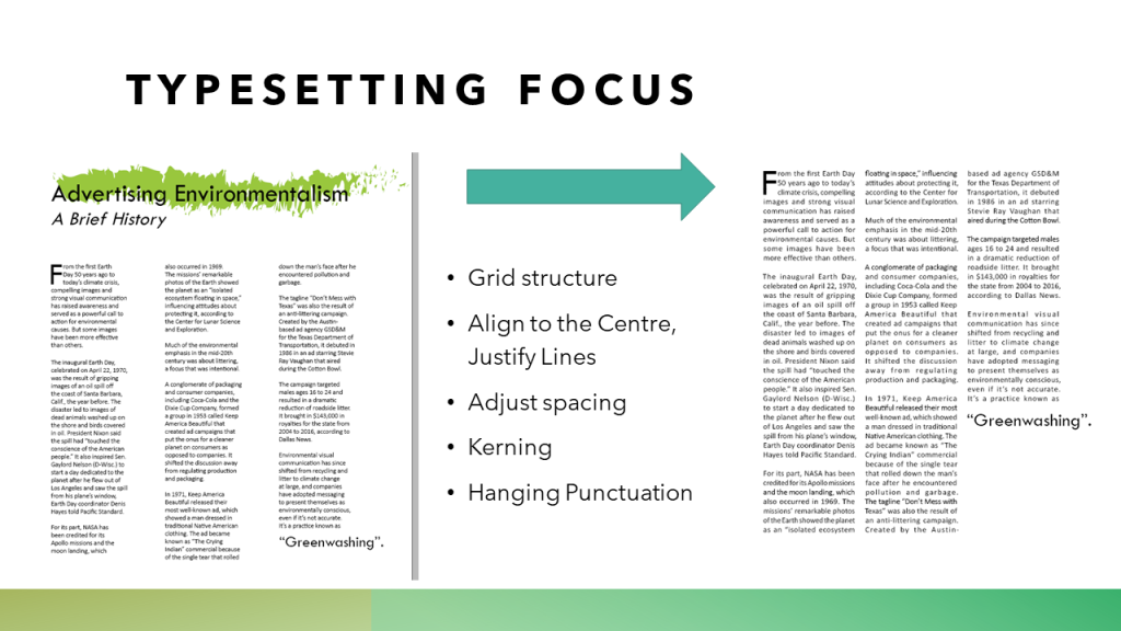
I took the time to research into professional practice in editorial graphic design, paying close attention to the structure behind different layout approaches. I also incorporated new typesetting features using InDesign that I found to be in line with professional practice.
I have become knowledgeable in the area of greenwashing, as was necessary to produce appropriate outcomes. I made sure it was an area I was well-informed on, in setting out the project proposal, so that I could select text which built up a view to inform graphic design audiences on this complex issue of greenwashing. I evidenced how my designs developed from my research to the final versions, taking screenshots through my process and critically considering the work.
Work for this project was largely independent and self-initiated, though taking on some feedback from tutors was a very valuable aspect of developing the outcomes. There were a lot of decisions related to the subtleties of adjusting the layout, of finding a consistent visual style and typographic approach throughout all of the pages of the outcome. Taking a critical eye to my own work was instrumental in developing it and making it more appropriate to reaching the proposed audience; written evaluations are where I evidenced this.
What parts of the project did I enjoy most and work best? Why was this the case, and how can I work well at all times?
I worked best after the interim crit. Taking on valuable feedback on the earlier version of my first designed spread, I was able to make changes to this that made it more effective. With the first spread at a higher standard, I was able to approach the following spreads with a clearer perspective on what works best in layout, with some variety in colour choice and making sure that the text is promoted in visually interesting ways. During this work I had a process that started with carefully researching each article I would use, identifying what aspects of the text could be visualised to create an interesting magazine spread design. I became more comfortable with approaching a spread for this outcome as the project went on, and I already had other spreads to compare subsequent work to.
What parts of the project did I enjoy least and find challenging? Do I need to develop certain skills based on this experience?
It took me some time to turn my extensive research into an effective approach visually. It was a challenge to start to approach a spread, with necessary research in mind, but find that aspects of the design were not effective. Bringing in visual responses to research earlier on has been a point to address in my work in previous projects, and it was a factor here too, though I did make sure that a lot of my visual approach was directly tied to my research this time. There was also a learning curve with making my InDesign skills more effective, where at first I found it challenging to know how to give the designs a neat and professional appearance – this is something I developed my practice in over the course of the project.
To develop my skills going forward in design, it would be worth considering how to get more out of my digital editing visual approach with the range of effects and tools in Adobe software. Furthermore, whilst I don’t intend to pursue a career in illustration, more experience here would be valuable to be a well-rounded graphic designer.
What areas inspired me going forward? What targets can I set?
It was inspiring to learn a lot of the different techniques and professional standards in editorial design and in the use of InDesign. I started to become familiar with professional typesetting practice, and working more in this area I could find more about different approaches to editorial design.
Also working towards the topic of greenwashing, inspired me as a designer to keep on noticing in ‘green’ brand images and design, with a critical eye to consider whether messages are truly environmentalist, and to be diligent about greenwashing and not contribute to that myself.
In what ways does the visual communication/message of the piece meet the needs of the brief?
The editorial spreads and cover visually communicate the issue of greenwashing as is needed to meet the brief. The visuals support text which directly communicates relevant information for the brief on the part that the graphic design industry has in graphic designers’ work for companies which gain an effective green brand image which may not reflect their impact on the world; the process of greenwashing. I paid attention to ways that others have visually represented the concept of greenwashing, and taking this inspiration I carefully put forward visuals that make this clear to audiences who may lack some pre-existing understanding of it, being introduced to the concept of greenwashing. I use a variety of images with heavily edited photography and vector-style illustrations, and I made consistent layout and typography choices, to respectfully reach an audience that may have significant graphic design knowledge and experience.
What are the strengths of the visual communication? Why?
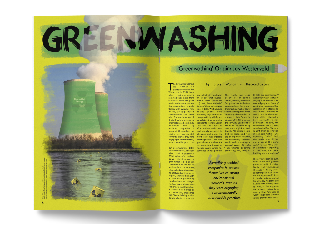
One of the strengths of the communication may be the use of existing photography. The issue of greenwashing has very important real world implications. Using photography which depicts air pollution, nuclear waste or landfill, and connecting this with the greenwash, is intended to help audiences understand that the green branding which may seem positive and virtuous, can be connected and provide the cover for, serious environmental harm, which the photography helps by visualising.
I use consistent typography throughout the spreads, and repeat visuals like the green paint strokes. This aims to keep all of the content connected visually, strengthening the ability for the client magazine to put forward a collective sense of this issue and its relevance to graphic design – with text content which is taken from different places which tells part of the issue but no article gives the full picture alone.
In what ways could the piece be mis-read or mis-understood by the audience? Be specific about who the audience is.
I took care to avoid the content being misread or misunderstood by the audience. Designing each spread, I first carefully read through the text content it features. I gained a clear understanding of what the message of the article is, so that my visualisation could be perfectly relevant and supportive of the articles which themselves were selected for forming a part of the overall message required by the brief to outline greenwashing and its connection to graphic design.
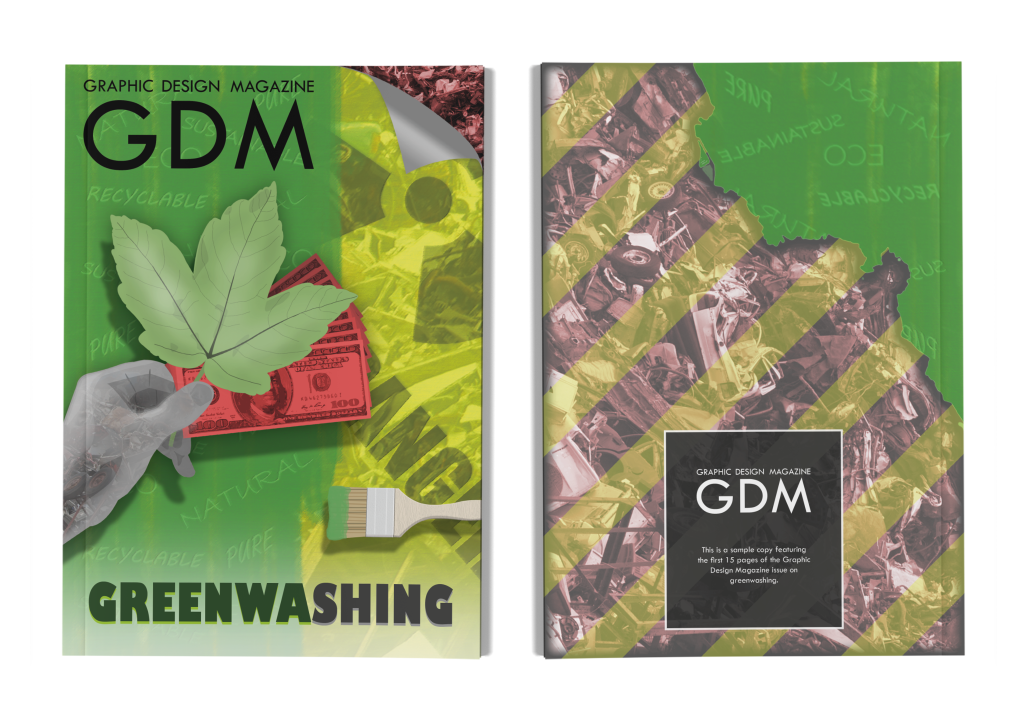
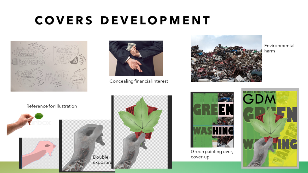
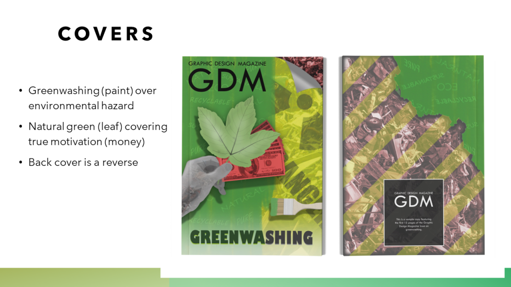
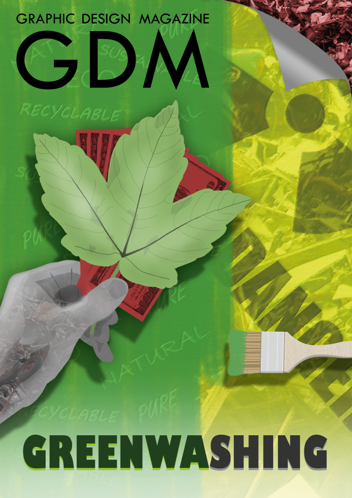
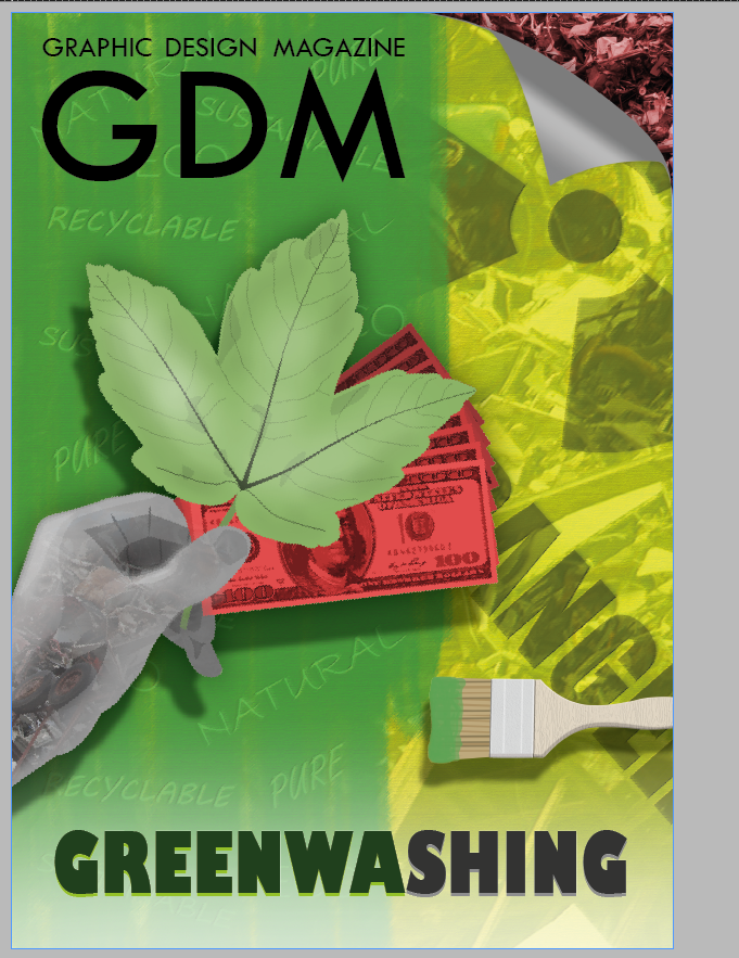
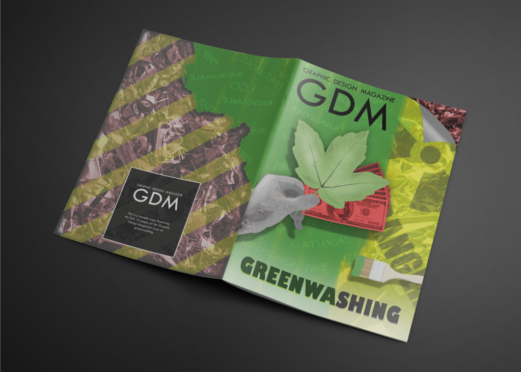
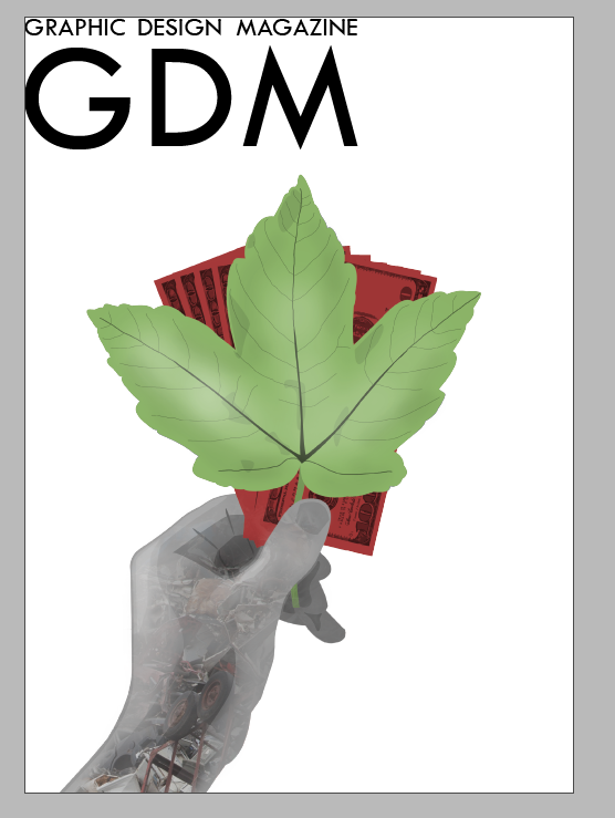
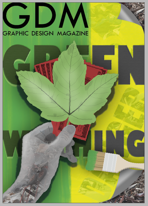
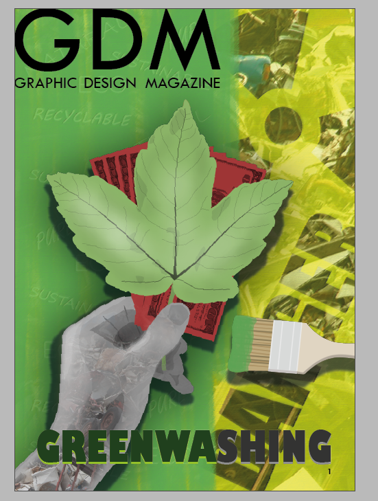
The word ‘greenwashing’ is prominently placed on the front cover, with somewhat abstract interpretations of the concept supporting this. The front cover shows green (and vague greenwashing phrases) painting over evidence of environmental harm, and also shows someone holding a leaf (with its obvious connection to nature) in front of money, coloured in red to contrast with the ‘positive’ green with a negative connotation, to show the financial interest that drives greenwashing. This front cover reaches people before the inside contents go on to explain these concepts which make sense of the front cover. I accept that the front cover may not be understood at first glance to audiences, but its main aim is to intrigue people to find out about what greenwashing means. Some bright and bold colour choices encourage people to find out what a front cover design alone cannot convey. I made some effort on the cover to avoid misunderstandings, such as scrapping original designs which separated ‘green’ and ‘washing’ into two separate words; keeping them together is important to properly introduce the term ‘greenwashing’. I also made sure that individual visual elements like the paintbrush and money were not too obscured, each conveying what they need to. I made a later-in-development change to make the money visual more exposed and brighter in an effort to make sure it could be understood as money immediately. Furthermore it is with respect to the generally open-minded and intellectual graphic design audience that the front cover may not be immediately clear, but invites finding out more.
In what practical ways could the piece be developed or improved?
Practically, if the design work to this brief were to continue, I would produce more spreads to eventually fill out a thin magazine on greenwashing at 30-40 pages. This would touch on aspects of greenwashing which were only partially or not at all addressed in the limited sample I have designed, such as detailing the climate crisis as it is relevant to greenwashing; breaking down the ways greenwashing can be spotted; the potential for the graphic designer to contribute significant environmentally positive work without the deception of greenwashing.
In other ways, perhaps the identity of Graphic Design Magazine could be expanded on or better-defined, as this was not a focus because it was not the matter of my brief. Also with extra time it would be appropriate to experiment with changing the front cover design, since this is something there could be many different approaches to.
With the intention to produce a sample copy for the Graphic Design Magazine issue on greenwashing, it would be ideal to provide a back cover design to pair with the front cover design. With this, I could potentially have a print design offering which provides a large portion of the inside content spreads, as well as the covers. As one of the first points of exposure that potential readers will have to the magazine, not providing the back cover would be to provide an incomplete sense of what the magazine final outcome would be.
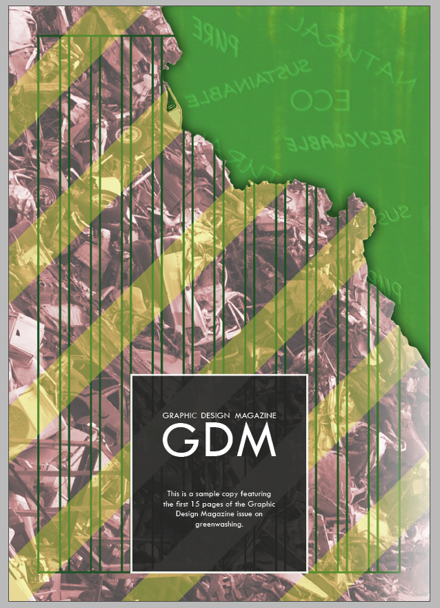
I decide a good approach to start with would be to have the back cover reflect the front cover. I considered this for the first inside page but went with a different approach. With both covers seeming like they belong together, a coherent sense of the magazine’s visual identity would hopefully come through to readers quickly.
With this in mind, my process starts with copying over the greenwashed backing poster to the front cover, with attention to how the colour of the unedited version is different, and how I could make edits to arrive at a version which is the same colour as the front cover.
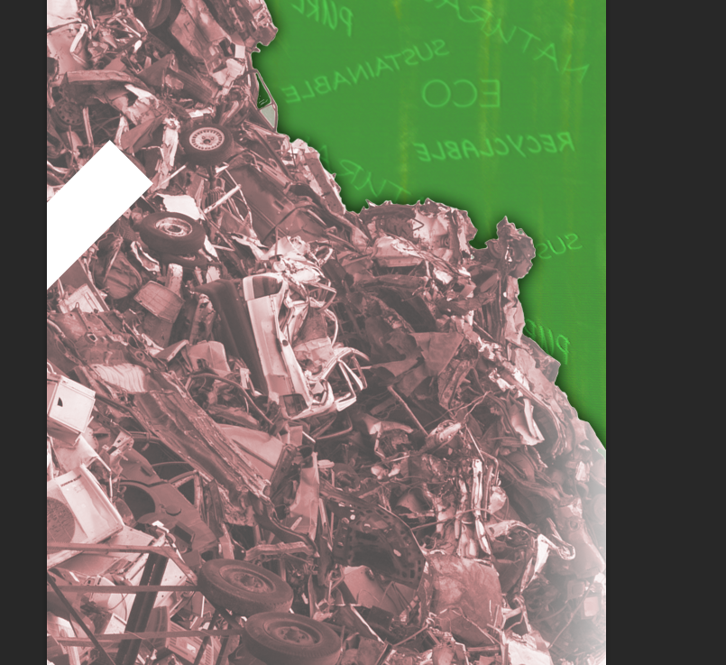
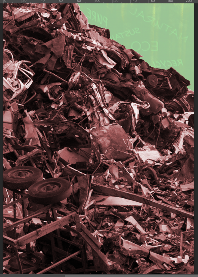
Here I am matching up the shades of green on the back and front covers, and beginning to consider how the covers would flow into each other. The background-removed metal scrap pile of a red hue has been inserted to the back cover, exposing environmental harm which the greenwash would seek to cover.
PREVIOUS WORK – INSIDE PAGE CONCEPTINSPIRATION – SIMPLICITY OF THE BACK COVER
Continuing with the idea of repurposing the early version of the first inside page, A similar layout is being established with the green area larger but in the same corner since this is where the green on the front cover can wrap around the back cover. The green text is reversed for a mirror effect, which may be interpreted as getting to look behind the greenwashing poster on the front cover.
I have a shortened text above, outlining that this is a sample copy of this Graphic Design Magazine issue. I researched examples of back cover designs on other magazines, such as the one above. I found that most tended not to have very much text or image content on them, with no clear sense that certain information must be included. The example above provides contact details, but I don’t have any of these for the fictional proposed client. It’s clear that I should make some efforts to make sure that the back cover isn’t more attention grabbing than the front cover, though the fact that that it is on the other side of the book should make it abundantly clear to audiences familiar with English reading that this is not the front cover.
I move the text box further down in a minor effort to make this text seem less focal and important, not like a heading at the top of the page, to bring attention over to the front cover. I also add a white glow edge to the right page over the scrap metal image, considering that this may help this image blend into the front cover which features a white glow at the bottom of the page, and the hand illustration as it meets the left edge is a light grey colour not dissimilar to the colour at the right edge here.
Here I experiment with an extra feature for the page. I add lines over my 12-column grid that has applied to all the pages of this design. This is in consideration of the graphic design interested audience, a feature related to specifically that which the magazine could in theory apply to all their magazines as it is not something specific to greenwashing. Despite this justification for the idea, the version above is visually unappealing. It makes the back cover seem messy and chaotic, despite the even spacing and pleasing structure that make it an appropriate form to guide the layout of the pages.
At this point I remove the columns overlay again to confirm that the design is more visually appealing without it. A dark outer glow is added to the edge where it meets the green backing poster reversed. This gives it the appearance of being a sheet of paper with a torn edge at the top-right, which is exposing a greenwashing attempt. I find this appropriate to make some sense of these two backgrounds meeting each other in this way, since the green backing poster does not provide a sky backdrop which would be necessary to help to make the metal pile seem like a part of an environment.
I re-insert the column structure overlay, having experimented with black colouration and lower-opacity placements, both of which were not effective. I find that this dark green colour is better than previous versions since it doesn’t stand out and distract from the rest of the page so much. Overall the appearance of the columns above still are visually unappealing, which means it can not be an appropriate choice despite its link to the graphic design audience.
I also added yellow lines over the metal scrap area. This conveys a sense of danger to be associated with this, as it should be visually associated with bright yellow warning signs. It links with the use of yellow on the front cover. It adds some visual interest to the back cover design without distracting from the important function of the text on the page.
Removing the column structure from the greenwashing area is better. It strengthens the concept that these could be two separate canvases, with one torn away exposing the other.
Despite having reached a better version with the placement of the 12-column structure as an overlay of the pollution image, I find the version above is more visually appealing. It allows each visual element on the page to stand out more; the text area seems clearer and more even, and the warning function of the yellow lines seems more impactful.
Another change was that I adjusted the spacing between all of the yellow lines to make absolutely sure that they are evenly spaced. Previous versions with the yellow lines were slightly uneven in their spacing, which is something that the keen eye of the graphic designer (a major part of the intended audience) may spot.
Front Cover Adjustment
PREVIOUS FINAL FRONT COVER
In creating the back cover, my attention frequently had to turn to the front cover as these are intended to have a visual link together. I noticed a flaw to the front cover design which I previously did not address as I found myself a justification for it.
The fact that the red paper in the hand is cash, is simply not clear enough. Despite my efforts to keep some major elements of the money visible, the numbers and details at the corners, it would take a close look to identify this. Not enough of the face of the note at the front of the fan is visible. The fact that this is cash is very important to introduce that there are financial interests in greenwashing, so it should not be so difficult to notice. The dark red colouration, serving as communication that this is a negative force and in contrast to the green, is also too dark to easily tell that this is cash. American money is associated with the colour green, and international readers would be even less likely to notice, which is certainly an issue as it can be assumed that UK audiences may be intended for this magazine (though I did not define that Graphic Design Magazine is a publication specific to any country).
Here I have made some changes to the fan of bank notes. I rotated it so that the face of the note is much clearer, not covered by the leaf much but still behind it. I also made the red colour brighter, which is of greater contrast to the darker details of the note to make is easier to see. I have the notes behind the front one in the fan gradually darker, to offer this some depth which it did not have.
The brighter red colour also has the benefit of making the front cover design overall slightly more eye-catching. The colour red is attention grabbing, and is of solid contrast to the green and yellow surrounding it. The involvement of this element is much clearer placed nearer the middle of the page.
However, the placement above doesn’t quite seem perfect. The fan of cash covers up a lot of the green area above the paintbrush. Losing so much of the view of this part of the page where the green paint meets the red, detracts from the concept that the green is paint that has been applied with the paintbrush. The paintbrush element was more effective when there was a clear line where the green paint ends, that would presumably be continued to be applied with the brush.
The fan of cash is also perhaps too far out of the way of the leaf. The concept of the green leaf acting as a cover for the cash is why it was so out of the view in the first place, and this concept is important as it links to how the cash is a hidden motivation of the green design that would be covered up.
I address the two issues I had with the placement of the fan of cash. The fan is rotated back upwards a little so that it is more obscured by the leaf, though still visible and bright enough to clearly to clearly be cash. It now seems more like there is attempt by whoever would be holding these things, to use the leaf to cover up the cash.
Rotating the cash up also leaves more of the divide between green and yellow exposed, so the concept that the green is being painted is clearer again. This is a solid compromise that I made a lot of slight adjustments to land on.
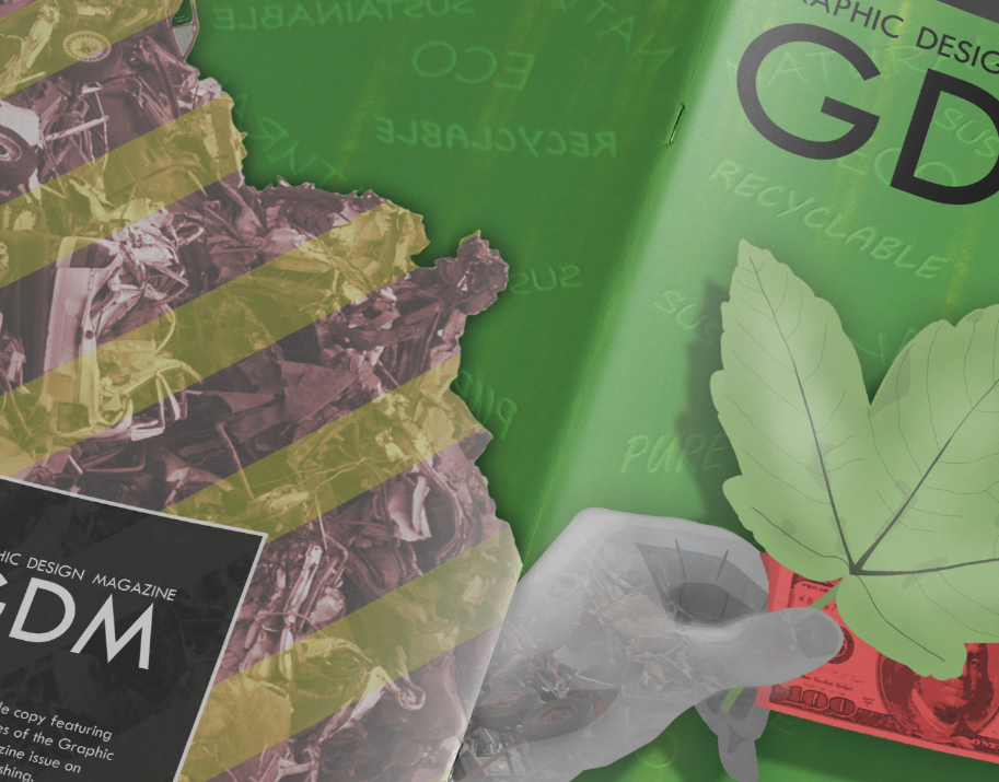
With appropriate final versions in place, I add the covers to a mock-up with the back and front covers exposed to see how they match up. The mock-up has a light reflection applied to the front cover to achieve a realistic look; I already made sure that the green is the same shade on the front and back.
Looking closely at how the pages meet above, it’s immediately clear that the way the hand doesn’t line up with the edge of the pile on the back cover will be a distraction. The features are close to lining up, but not close enough, so it looks like an error that they were intended to be connected but are not.
I correct the above-mentioned mismatch between the top edge of the hand and the edge of the pile on the back cover.
The pile still did not blend in with the edge of the front cover, though, so I decided to make it clearer that these parts of the pages are not intended to flow together. I remove the outer glow from the divide between the greenwashing and the scrap metal on the back cover, and instead apply a dark inner glow the pile. This gives a visual divide between the this part of the front and back so that it does not look like there was a failed attempt to connect this part of the design.
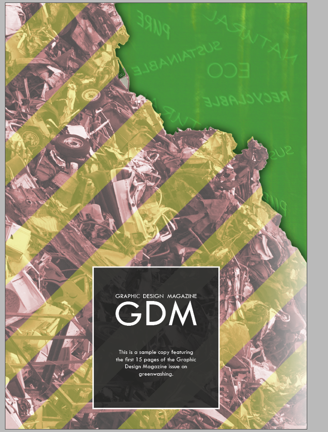
The resulting front and back cover designs communicate the issue of greenwashing and link with the visuals inside the magazine. The text is very clear and the colours are bright enough to serve as an attention-grabbing introduction to the complex concepts outlined within the magazine.
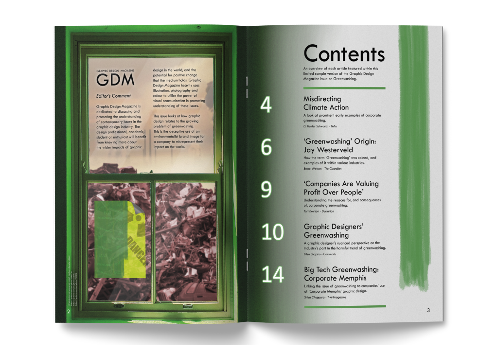
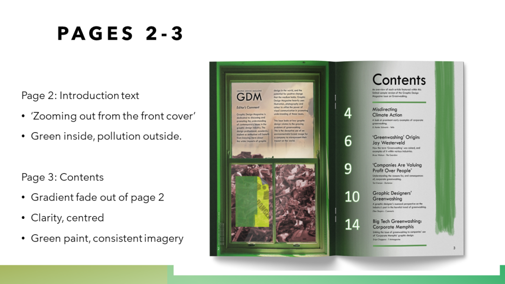
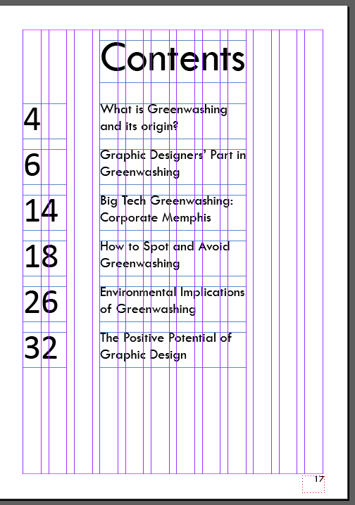
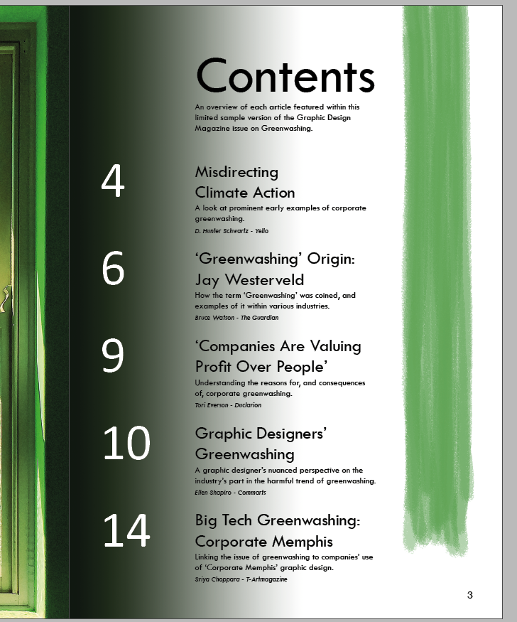
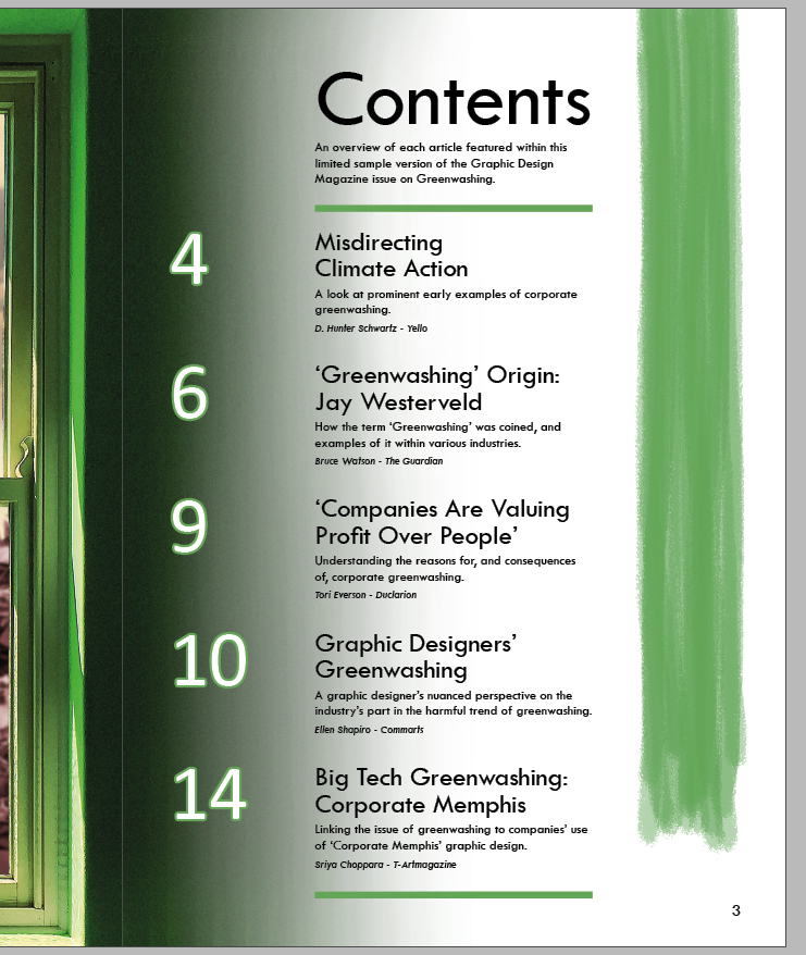
With an appropriate version for the introductory left page of the spread, I set to designing the list of contents for the magazine. This page would require less visual elements than the complex left page, but need to be designed in a way that fits the other pages in the magazine.
I turned to various examples of how other magazines displayed their list of contents. Many magazines have a lot more contents to list in a small space than this magazine does. They also have more photos to display typically as their content relates to people; this magazine requires a different approach from most prominent examples.
I take inspiration from how this uses bold colour choice to bring attention to this spread, without any detailed visuals. The page uses bold, evenly sized numbers set over two columns as a clean structure to the page. Boldly displaying the page numbers is a choice that makes sense for quick navigation to relevant topics that the reader might be looking for specifically.
This example does feature photography, but these are simple relevant photos that don’t take the focus of the page as a whole as a centrepiece of any kind. This also shows even large sized page numbers with bold text to be clear and easy to use for navigation. There is structure to the even spacing between each number and corresponding text, and this fits in a box below the heading.
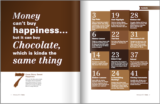
This is an inventive, intriguing way of displaying contents without photography or illustration. Shades of brown relevant to the subject of chocolate are an effective way of keeping this page linked to the appealing subject of the text. A sense of luxury and indulgence comes through with the serif numbering, clearly showing how the choices of typography for the magazine remain important for the content page. The use of boxes here keep a large amount of text palatable and well-separated, where this would be a very ineffective spread if the text was black and had no boxes.
This content is very neatly arranged, using the full page space to display a lot of information. This page likely won’t pull in much attention, but for an academic audience it’s relevant to, this is a neat way of displaying all important information with ease of navigation, using bold text and line structure in this regard.
In listing contents, an issue emerged. My brief that I have produce spreads for is for a sample of spreads for a larger magazine. The contents page of a final version of this magazine would have more content than I have designed. Whether I should design the contents page to guide what I have designed, or also include what could be included further past this, is not a clear choice. I make a decision on this further down.
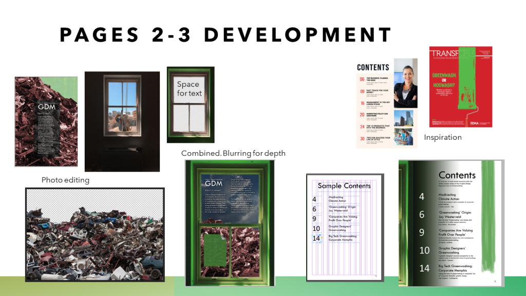
With inspiration in mind, I start out with a simple list structure given how limited the number of contents I need to place are. I use large numbering as I saw in other examples, adjacent to each corresponding listing. I list the beginning of each featured article, all using the magazine theme Tw Cen MT typeface.
Here I start trying out the approach of making up what content could reasonably be expected to be included in the magazine past where my spreads end at page 15. I considered the briefed message of reaching people about what greenwashing is, the environmental harm of it, and the complicit role that the graphic design industry has in it. The headings for potential content past page 15 all relates to this. The heading changed to just ‘Contents’ rather than ‘Sample Contents’ to reflect this this listing would cover the whole magazine. Research indicates that a magazine of less than 40 pages is shorter than the typical publication, but in no way unrealistic or unheard of.
Switching back to listing only the content that I have designs for, I add a dark gradient from the left. This is intended to match up with the edge of the image on the left page which is a very dark green colour. Fading into the light colour on the contents page is a way of keeping most of the right page surface light, for readability with the black text, whilst also keeping the two pages connected. Using white letters as a contrast to the rest of the text could also add some visual interest.
I add a large green paint stroke here. It’s placed on the left as a barrier at the gradient, as a way to frame all the numbers. Using a green paint stroke keeps this spread connected with the rest, as I frequently use this visual for simple communication of the greenwashing issue.
INSPIRATION
It is at this point I decide to stick with only listing the content I have designs for. Adding more of a description to each listing will give readers a better idea of what each part entails, which would be important for those of the audience without much familiarity with the subject matter. It also gives proper credit to each of the authors I have sampled text content from, which is not something I could add for content listings which I have not designed and selected text for. To account for this choice, the description beneath the heading explains the concept that this, and the contents listing, are for a sample copy of what would be a larger magazine.
12 pt text is used for the descriptions of each listing, and 10 pt text is used for the author credits – these sizes are appropriately small and still reliably readable. Adding this fills out the page, whereas the page previously seemed too empty and as though it was missing some content.
I moved the paint stroke to the right side of the page. I found that it was difficult to centre the numbers within the paint stroke area, so the result was not as visually effective as where the numbers are just placed at the edge over the dark gradient area. Moving the paint over to the right helps to make the page more balanced, as it seems to mirror the dark gradient on the left side in a subtle way. This balance is effective for framing the contents text which is arranged in the centre of the page.
I made some changes to make the page design more effective. Adding green lines to sandwich the list of contents, helps to make this listing seem more organised. These lines stretch to the middle 6 (out of 12) columns in my layout structure, as do all the text boxes around them.
I also added a green stroke to the numbers, the same stroke used on the green lines. It was just a subtle choice to add some visual interest which seems more visually effective than not using the stroke.
Another important change above was I paid close attention to the line spacing on the page. I made all the two content heading lines closer together, and the first description line of each listing further away from the headings. These subtle changes to the arrangement of the typography are important to take the time to consider, especially considering the graphic design audience it aims to reach.
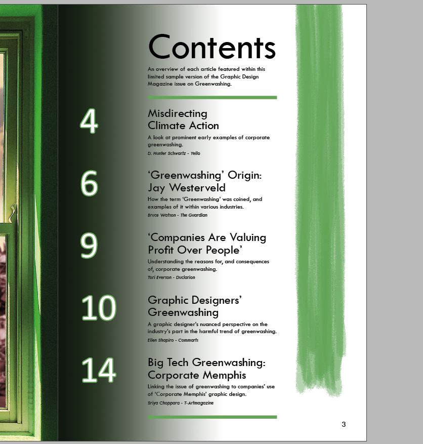
Above I show a look at my process of replacing the gradient on the left side of the page. The gradient was always intended to match the far edge of the window image on the left page. Copying a solid colour was not able to match this look, however, since the window edge is a grainy dark green that very slightly varies in colour.
My solution to this was to instead use the clone stamp tool to take directly from the window edge on the left page, and carry that over to the right page. From there it is a careful process with a very large, 0% hardness, very low opacity eraser tool to gradually remove some of the clone stamp filled area, until the result is a gradient effect that matches the window on the left edge of the page, and is light enough before the start of the black text of the content listing.
The gradient effect using the grainy dark green from the edge of the left page is visually effective here. It keeps the pages connected as intended, carefully fading into the white background where the green paint stroke is a strong contrast.
INSPIRATION
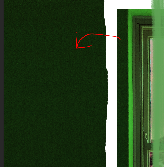
Here is the spread with some slight adjustments to the left page following from the previous post. I decided to create a version of the backing poster on the window, with the half-painted green cover over the yellow, but without the landfill texture as this is taken from the background. I switched back to not using a fully green version since I find it could be a lot clearer that this connects with the front cover this way.
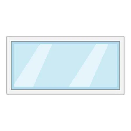
Additionally I added subtle light blocks diagonally over the window area. I was concerned that it might make the concept that this is a closed window not believable, to have no glass overlay effects on the window. I took some inspiration from existing glass pane photos and clip art, such as the image further up, to see how to represent a glass pane visually and simply. The diagonal bars match what is often used to visually convey that there is a pane of glass, and the result I added is subtle so as not to distract from or obscure what is behind the window.
This current final version of the post may change slightly before final submission, but overall I am satisfied that it fits in with the rest of the spreads I have designed, and introduces the topic of greenwashing with some interesting visuals.
As the pages for the spreads are numbered in order, I find it would be in line with professional practice to include an accurate opening spread. My initial first spread begins the text content on Greenwashing, but before this, an introduction to Graphic Design Magazine and a list of the magazine’s contents are in order.
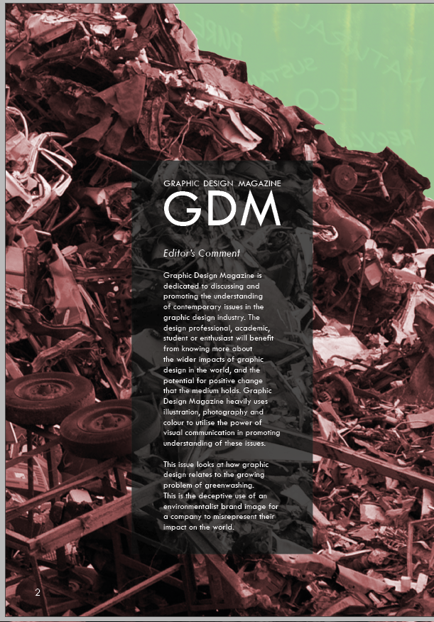
I start by thinking of ways that the first page past the cover could mirror the front cover in some way. I start by taking a literal approach to this, by reversing the backing poster to the front cover, as if seeing the reality behind it. The poster is intended to represent the way that greenwashing acts as a cover of companies’ environmental harm, and the information in this magazine then brings people to see past that cover. To start this, I add a light overlay to the reversed image and remove the page curl, to try and accurately capture the effect of seeing behind.
The cover’s backing poster was covering up evidence of severe landfill pollution, so here I bring in that same unsightly image of the metal scrap pile with a slight red hue to emphasise its harm. This should, in a way, force the reader to confront the kind of environmental harm that greenwashing should be associated with for covering up.
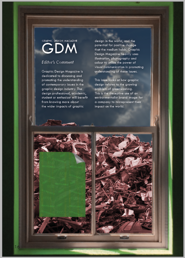
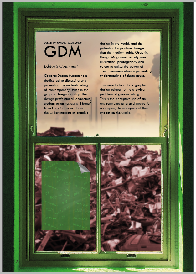
I use a lowered opacity black box to sit a description about Graphic Design Magazine and this issue on greenwashing specifically. The box is a mild contrast to the dark background, necessary to be sure that white text could have appropriate readability. I use the same typography for the magazine as seen on the front cover, and limit the box to sit within the centre 4 columns of the page. The text reads:
Graphic Design Magazine is dedicated to discussing and promoting the understanding of contemporary issues in the graphic design industry. The design professional, academic, student or enthusiast will benefit from knowing more about the wider impacts of graphic design in the world, and the potential for positive change that the medium holds. Graphic Design Magazine heavily uses illustration, photography and colour to utilise the power of visual communication in promoting understanding of these issues. This issue looks at how graphic design relates to the growing problem of greenwashing. This is the deceptive use of an environmentalist brand image for a company to misrepresent their impact on the world.
I took time to carefully consider how the magazine is relevant and appropriate to the mostly graphic design concerned audience, to land on the text content above. I also give some justification for why many of the spreads have such prominent visualisation, with many full-page photographic-illustration pieces, about fully utilising the visual medium.
The introduction to greenwashing is very brief, as the following spreads also take the time to introduce the topic for those not yet familiar with it.
I was somewhat dissatisfied with the resulting page introducing the magazine. I felt the reflection of the concept wasn’t coming through well, and may not be noticed by the audience at all. Placing a full-screen sized poster behind the pile of metal waste also didn’t make any sense, which might be a problem if I made this placement more obvious since I am aiming to engage audiences with very real issues.
I decided to consider changing directions, reflecting an aspect of the front cover in a different way whilst implementing some similar imagery. My first step above was to manually remove the background from the metal pile above, since the automatic background removal was unable to make the desired change. Removing the sky background to the pile makes the image more versatile, to be placed on a full-page illustration with as much clear space above the photo as needed.
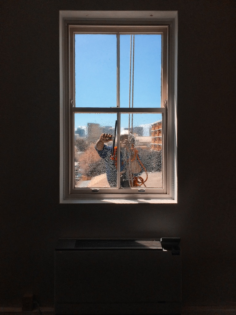
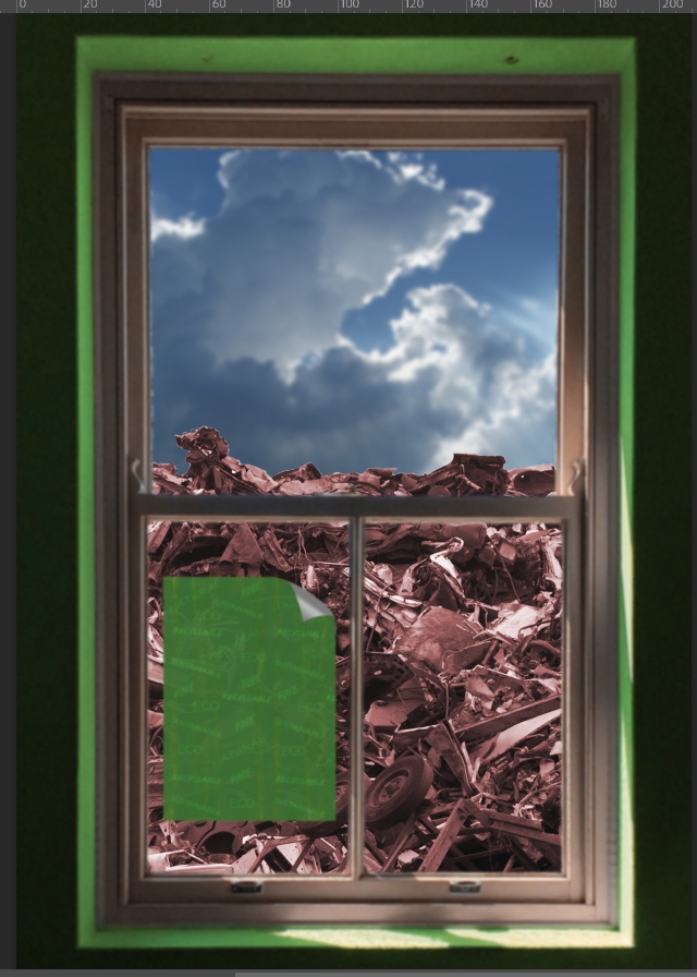
My idea for this second concept is to zoom out on the front cover’s backing poster. This would be to place the poster on a window in front of the metal pile, which would explain why the pile is visible past the poster as the poster peels away on the front cover’s top-right corner. I sourced the CC0 free use image above to begin putting this concept together.
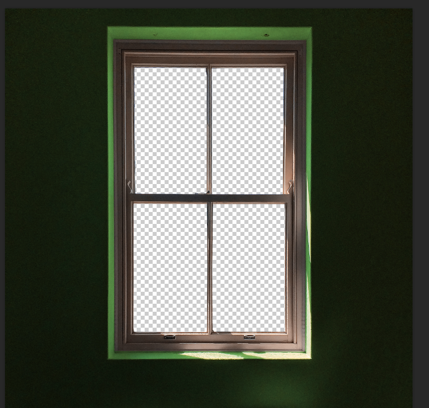
I manually deleted the window area as intended, so that I can then place the metal scrap pile behind the window to be the view instead of a window cleaner.
I added a green overlay to the wall paint to help to convey that this space inside identifies with a green image, which should be viewed in contrast to the unsightly scrap pile in view outside.
Here I place the original version of the backing poster on the window area, with the scrap pile behind. The concept of zooming out from the framing of the front cover to see around the poster is intended here, though some work would be needed to help the poster to seem more like it belongs there, conveying some depth.
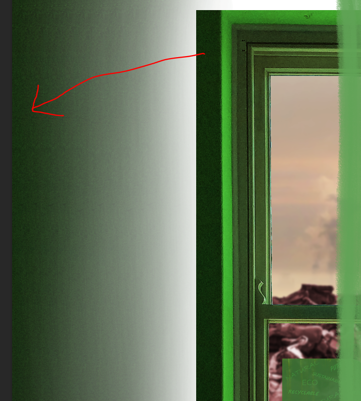
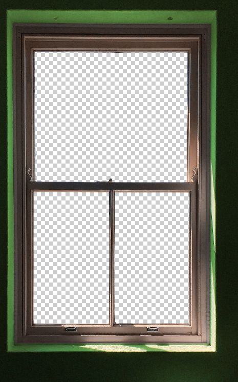
Anticipating that I would need to place the text inside the top half of the window, I decided to remove the bar in the middle of the top, with careful use of the eraser and using the clone stamp tool to correct the window bar at the top.
I decide to replace the half-painted version of the backing poster with a fully greenwashed poster. The concept is that the inside view might be of seeing the poster after the painting has finished; the paintbrush is no longer over the poster, so the painting is implied to have finished and leave no yellow warning area showing. The logic to this change does come at the cost of making it different from what is seen on the cover, so it might be that audiences wouldn’t link this to the cover. This may not be an issue, though, because the poster shows a green cover-up with vague language in contrast to a scene of environmental harm outside the window.
The parts described above come together with the version above, showing the greenwash poster on the window with the waste behind, and a sky photo inserted above it: https://pxhere.com/en/photo/1009618
Thinking about how to convey some depth, my approach above is to blur the foreground and focus on the waste out the window. This can link to how the content of the magazine invites people to look past the greenwash. The consequence of this, however, is that the greenwashing text on the window poster is no longer readable.
I apply text summarising Graphic Design Magazine and this greenwashing issue, the same text content as was seen in the previous version further up. Removing the bar from the middle of the upper section of the window is certainly necessary to fit the text without making is smaller, as it’s a tight fit. The window frames the text well, however. The text fits into two columns and uses the space of the window effectively.
My next change is to sharpen the metal waste pile in the background, to make clearer the photographic effect that the focus is on the background, explaining the strong gaussian blur on the foreground elements. I appreciate how this really invites the reader to look through the window and find it effective for the meaning of the greenwashing text to look past the greenwash.
Issues seem to remain however, with how the poster cannot be read, but must be blurred as it’s a foreground element. Also, the text doesn’t have perfect readability since the sky background is not dark enough or light enough to sit either black or white text perfectly. It’s darker than it is light, which was intended for the sky not to be a perfectly sunny day as this would seem too positive. I can’t make the sky darker than this however, since there is clearly light coming through the window and the sun is out – it would be out of place for this to be much darker. Still the dark glow around the text isn’t quite enough to surpass all readability concerns.
I find a new photo to use for the sky backdrop. This is light enough to sit black text, which is preferable for readability over white text. The lightness makes sense of the light hitting inside the window frame, but doesn’t have an unfitting positive connotation of sunlight; it’s a lightly coloured cloud with visible sources of air pollution.
I also change the approach with creating a sense of depth. I instead turn focus onto the foreground, and blur the background. The risk with this approach is that it wouldn’t be clear that the background is a harmful landfill. However I find that even with a heavy gaussian blur, a negative sense that the background contradicts a green image is clear, which is helped by also having pollution visible in the sky.
The window frame and green poster are now clear, which brings back the benefit of being able to link the poster backing the front cover, to this on the first page inside. Another concern I had with blurring the foreground was that somehow the photographic effect would not be clear when printed in A4, that it would look like an unprofessional error on my part that there was this blur. It should be clearer that the blur is deliberate since people may expect more to see a background blurred and have attention drawn to the foreground.
Still considering that there is merit to having the sharpened view of the metal pile in the background, I experiment with having the ‘best of both’ with half of the page blurring the foreground and the other half blurring the background. I quickly realised that this will be too distracting however. It’s such an unusual effect that people will wonder what the significance of implementing it is, and thus will take away from communicating the issue of greenwashing.
I have some extra changes above, sticking with the approach of focusing on the foreground with a blurred pollution in the background. I switch to the B-master on InDesign, with white pagination as a stronger contrast for the green in the bottom-left. I also add image sources in accordance with professional practice.
I also add a soft white glow around the text, since I still had concerns that there could be slight readability issues for the text against darker parts of the background, especially considering the design could display colour slightly differently when printed. The glow is intended to aid readability without becoming a distraction.
I next need to move onto the right page adjacent to this left page on the spread, which lists the magazine contents.
With a version of the main image at hand, I consider more about how the image will be placed on a spread. I had in mind that it would take up the entirety of one page, away from most of the body text, since it holds A4 dimensions.
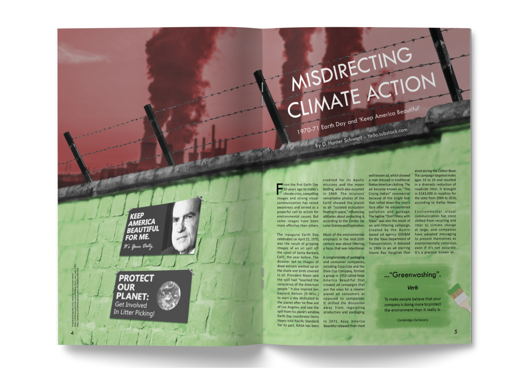
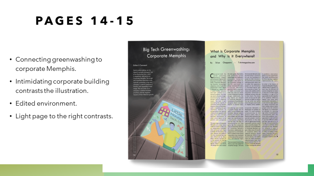
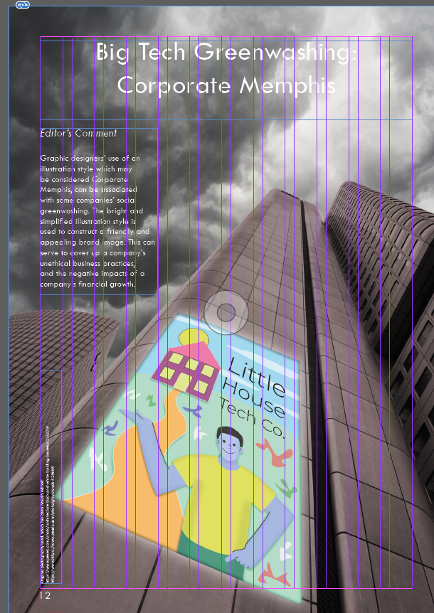
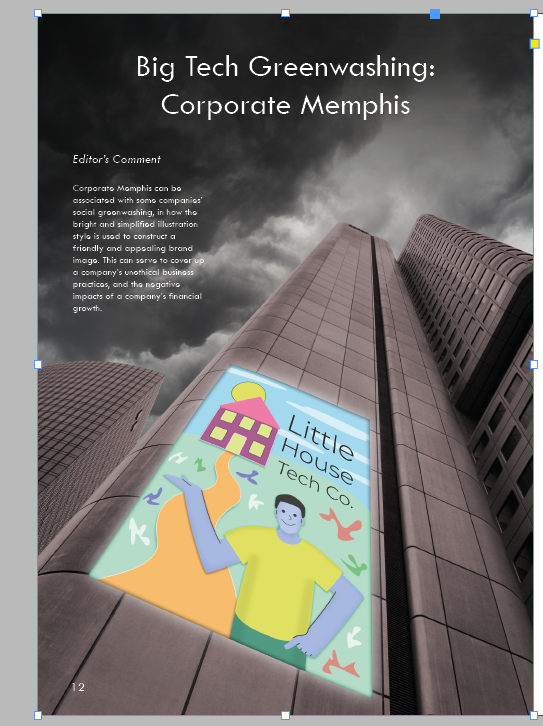
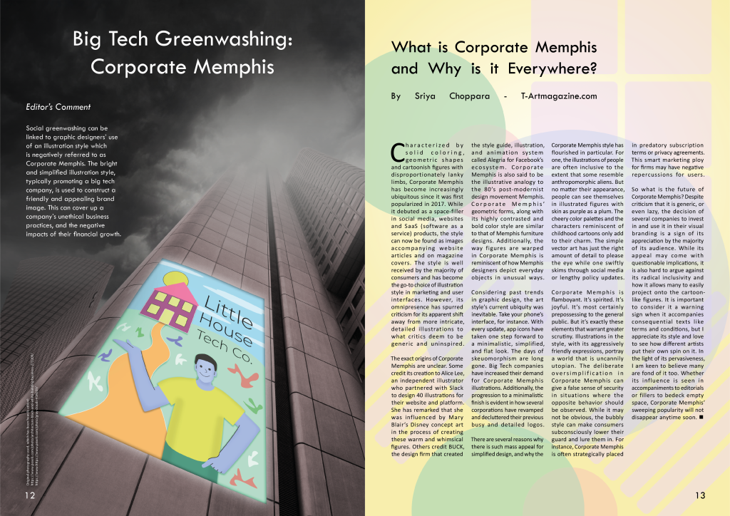
I set the image on the left page, where the image credits can be placed at the bottom-left corner, so that the right page can have undisrupted space for body text. I place a heading at the top of the image to introduce the concept of Corporate Memphis and its place in the discussion of greenwashing.
The headline however likely does not provide enough context for the image, and I know that the article that will be used on the adjacent page will not clearly outline the link between Corporate Memphis and greenwashing. Therefore I briefly outline this in my own ‘Editor’s Comment’ to the left of the page, out of the way of the buildings. I took care to make the text clear and short enough to fit within that space on the page at 12 pt.
The previous version of the page raised issues of readability, since part of the heading was difficult to read as the white text was set on a bright part of the background. I add a light black brush over the top portion of the page, acting as a natural gradient which doesn’t distract from the look of the cloudy sky and the image as a whole.
I also found that darkening this area enhanced the ominous, negative atmosphere to associate with the ‘big tech’ buildings, so proceed to consider if this should be taken further.
Above is the final version of the left. I make the sky darker to enhance readability of the editor’s comment, whilst not going too far with this to keep the cloud formation visible.
Further editing was done to the image, with a light grey brush applied near the top of the buildings. Obscuring the view of part of these buildings serves to enhance the mysterious, almost threatening presence of the buildings. I carefully erased part of the top of the building which is obscured by fog, to complete the appearance that the building is so tall that the top cannot be seen.
I moved the buildings and Corporate Memphis poster, slightly over to the right to clear more space for the image credits at the bottom-left. It was more of a distraction to have the white text right up against the edge of the Corporate Memphis poster. I added a subtle dark glow around this text also, so that it is readable against the background.
Finally I made changes to the ‘editor’s comment’ text content, with minor re-wording and clarification. The final text as seen in the image above is as follows:
Social greenwashing can be linked to graphic designers’ use of an illustration style which is negatively referred to as Corporate Memphis. The bright and simplified illustration style, typically promoting a big tech company, is used to construct a friendly and appealing brand image. This can cover up a company’s unethical business practices, and the negative impacts of their financial growth.
Right Page
With the main image and introduction to the concept of Corporate Memphis in greenwashing on the left page, the right page needs to contain all of the article text taken from t-artmagazine.com. This text-heavy page should contrast with the mostly dark left page and neatly arrange the text to not be off-putting and overwhelming to the reader.
INSPIRATIONINSPIRATIONINSPIRATIONINSPIRATION
I take in a lot of visual inspiration on what a Corporate Memphis style background could look like. The most defining features of Corporate Memphis are figures of people with simplified features, and in many cases blue-pink skin tones with oversized limbs. These tend to be placed over backgrounds with mostly solid colour and background features that lack depth, promoting whatever a company finds relevant about what they offer. The text on greenwashing points out ‘geometric shapes’ as a key trapping of Corporate Memphis, so using these would make sense when I’m not aiming to show any specific items.
I start by placing simple shapes on an A4 area, with various block colours and limited opacity. I keep the use of geometric shapes in mind, and start to build up a page that looks like it would be a fitting backdrop for an illustration that would be negatively called Corporate Memphis.
I lean towards adding more warmth with a warm yellow background. This is to increase the contrast with the dark, quite cold feeling image on the left page. This warmth would be used to help construct the friendly and inviting brand image that can be criticised as greenwashing. I also control the opacity of some of the various shapes more, and fill the page with a somewhat even distribution of shapes.
I now insert the body text with the article’s heading, and it takes up 4 columns across using the same typography choices as in previous spreads. This makes it clear that this approach to focusing on a background illustration is appropriate, and going further to add another foreground element might make the page too busy, especially when aiming to draw attention towards the main image on the left page before they take in this information-heavy right page.
I find that the coloured shapes are slightly too vivid, and not light enough to assure there are no issues with readability for the small black body text.
Adding a light overlay to the background shapes brings the page to a point where the geometric shapes typical of Corporate Memphis come through, but are muted enough to hold the text as needed. I also add an extra shape to the bottom-right corner and move the circles over to the left, so that there are no clear spot that stands out, keeping the background balanced.
The resulting spread has a strong colour contrast between the two pages. The issue of Corporate Memphis as is relevant to the text content is clearly visualised, and should first invite the reader to the image on the left page which introduces the term and its link to the content on greenwashing in the previous spreads.
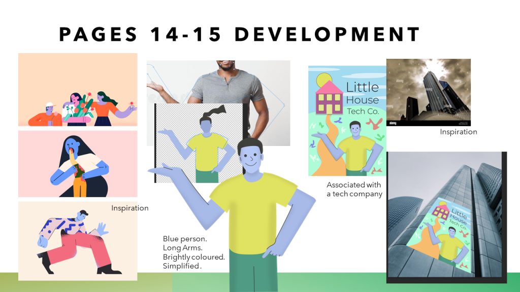
Having found a point of interest in the trend of Corporate Memphis from previous research, I decide it would be valuable to include a spread which features this issue for a part of the sample of the Graphic Design Magazine issue on Greenwashing.
INSPIRATIONINSPIRATION
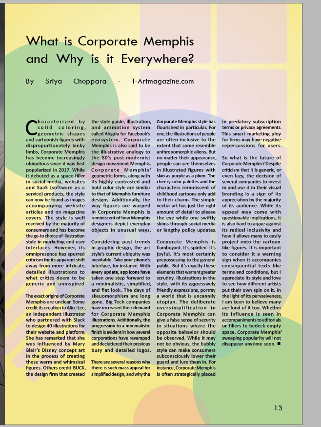
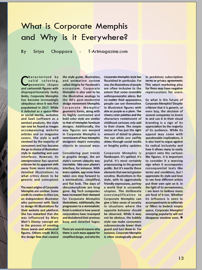
I searched for text which gives a brief summary of what corporate Memphis is, which touches on how it can serve as a visually positive cover to harmful business practices in a similar way that design can be criticised as Greenwashing. I found this article provides that summary which could comfortably sit over one spread: https://t-artmagazine.com/what-is-corporate-memphis-and-why-is-it-everywhere/
I identify a way of directly naming Corporate Memphis as a type of Greenwashing. Articles are clear that the illustration style is associated with tech companies, and is often attributed to tech giant Facebook.
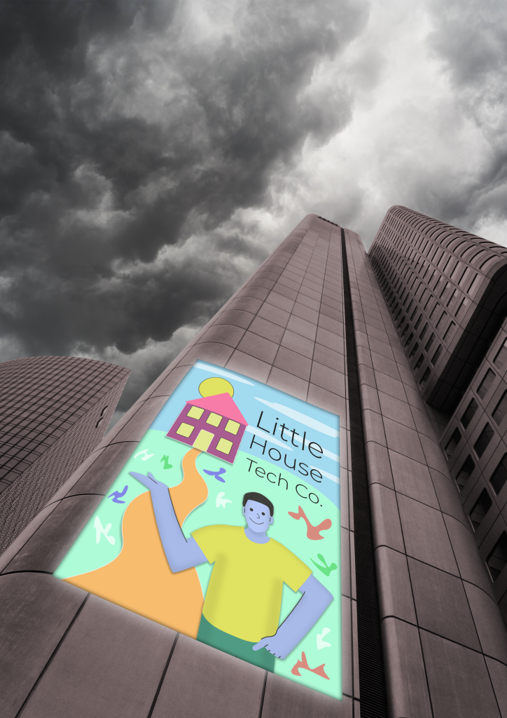
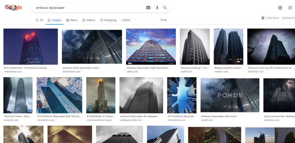
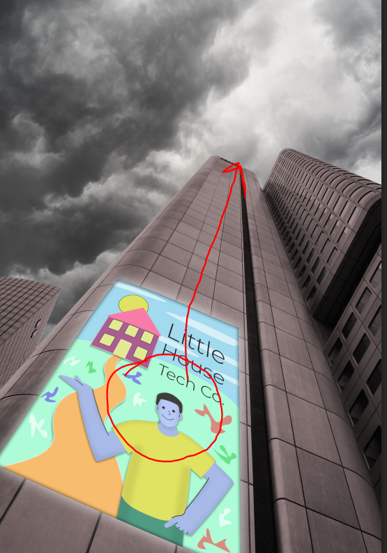
To visualise the concept of Corporate Memphis as big tech Greenwashing, I search for high-rise/skyscraper buildings that have a dark, ominous quality to them. Tech companies would be known for having headquarters in this kind of building, and for the purpose of showing that there can be negative impacts of these companies (invading privacy, contribution to the climate crisis), clear negative connotations should be attached to the big tech building.
The above CC0 Free Use image is ideal for its dark exterior, and that it offers a clear wall to attach a corporate Memphis design to. The concept is to put a sign on the wall which represents the company that uses the tall, uninviting building. This building using a corporate Memphis design as their front brand image, is to provide a fictional and exaggerated example of how the light corporate Memphis illustration may have a far darker impact behind it.
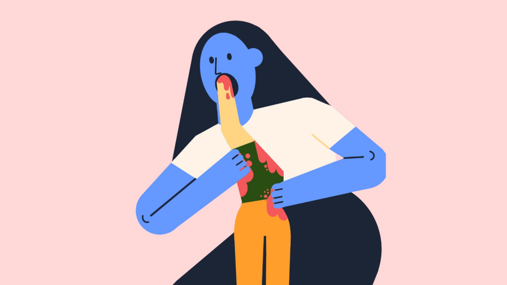
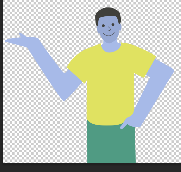
To start to illustrate a person in a corporate Memphis style, I use a figure of a person as a rough guide, from which I will extend the size of the arms and work towards a more unrealistic corporate Memphis style. I chose this person because their body language is inviting, and their right arm could be used to show the person upholding the brand name or image, keeping the person closely linked to a corporate identity.
I continued developing the illustration with the vector style pen tool shapes technique I used for others, to create a simple style which can be recognised as corporate Memphis.
In particular, to exaggerate and match the typical corporate Memphis illustration, I use brightly coloured clothes, a blue skin tone, and bring out the large limbs.
Research into the style leads me to use simple curved lines to represent the nose and mouth, and solid circles for large eyes. The friendly looking corporate Memphis person is devoid of any discernible unique facial features, as intended.
INSPIRATION
To add some effective extra touches, I add lines to certain parts of the person, and softly shade in the sides of the person. I was inspired by other examples of corporate Memphis to add these extra touches, which still leave the illustration very basic.
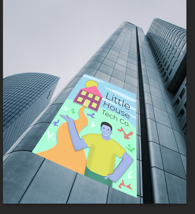
As intended, I place the Corporate Memphis figure onto a poster size page and add simple visual elements to create a scene to associate a tech company with the style.
The name ‘Little House Tech Co.’ was inspired to directly contradict the large building the design is placed on. The fictional Corporate Memphis poster directly misleads audiences who would assume this company is of a modest size and operates on a small premises. To place this design on large skyscraper would be clearly contradictory, and thus in line with the worst greenwashing practices which should be criticised.
I add more details to the poster whilst maintaining the simplistic style intended. Simple shapes to represent the sun and some clouds make a basic, positive scene, but I refrain from making things too spirited and joyful as it needs to be a glaring example of Corporate Memphis rather than being a fun, childish setting. Some coloured shapes are added around the grass just to bring in some of the colour range that can be seen in this illustration style, which will frequently use small motifs/doodles like this. I also added some more outlines and subtle drop shadows to add a little visual variety where it does not distract.
I used the warp tool to place the Corporate Memphis illustrated poster on the previously selected skyscraper image. The structure of the building serves well as a natural guide for placing the image at a size and angle that looks like the poster is attached to the building. The image is immediately a contrast to the dull appearance and towering height of the building, but further edits are needed to bring out the ominous atmosphere intended to be associated with the setting, and to make the poster really seem to be a part of the wall.
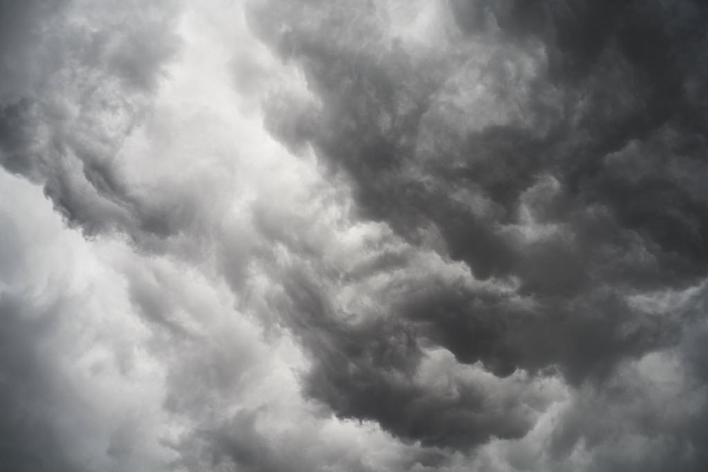
I quickly identify that there is a missed opportunity for the image in having a clear, dull sky above the skyscraper. In search of a sky that would be more appropriately negative and atmospheric, I find the cloudy image above with a varied stormy appearance that may help to add to the sense that the corporate building is not appealing or innocent.
I cut out the sky from the skyscraper image and insert the sky. The angle of the sky in the frame makes it seem like the clouds could have been an original part of the building photograph, so the sky is not an unfitting distraction and makes the overall image more effective.
‘Attention indicated in red’INSPIRATION
I reverse the image so that the bright spot in the sky appears over the main skyscraper which extends up towards the right of the image, to help to draw the attention which should immediately go to the Corporate Memphis poster, to look up along the extending building towards the sky.
Following, the image needs to be placed as the main visualisation for the spread on Corporate Memphis, and edited as needed to effectively support the text content and invite audiences to understanding how this connects with greenwashing.
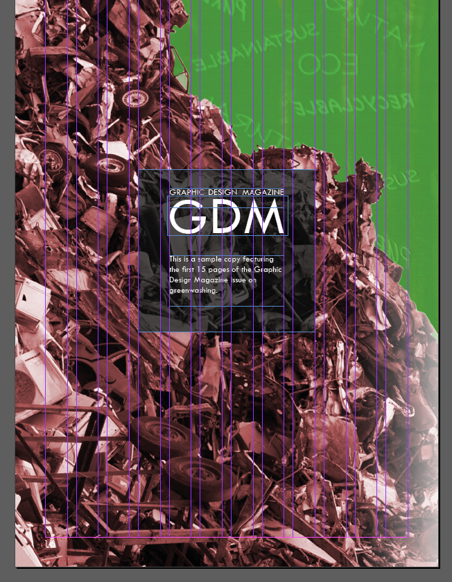
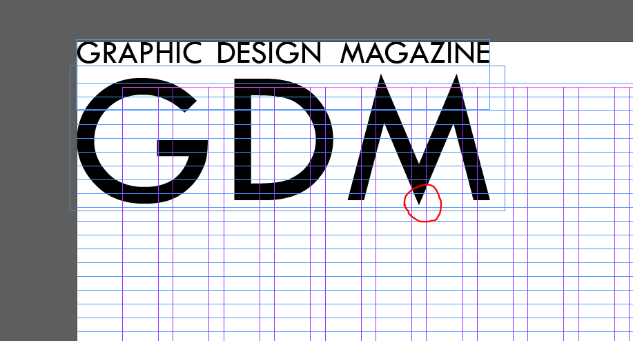
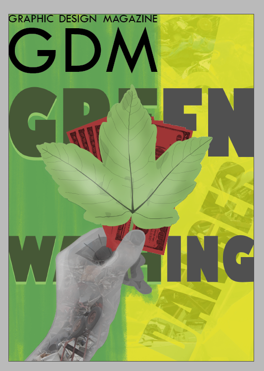
The illustration intended for the magazine cover is applied to an A4 area above. I started, as well as the illustration, with the acronym name for the magazine. My brief states that a graphic design magazine is the client, so I applied this simple name with an appropriate short acronym. I used the same Tw Cen MT typeface for this, to match with the design across the spreads. In moving and resizing this, I found it could be effective to have the middle of the ‘M’ in the middle of the page, as a subtle way of reinforcing some structure to the page. I find it visually effective to have the tip of the leaf reaching up to the middle of the ‘M’, as it draws the eye between these two elements; making note of the magazine name, and understanding the focus of greenwashing.
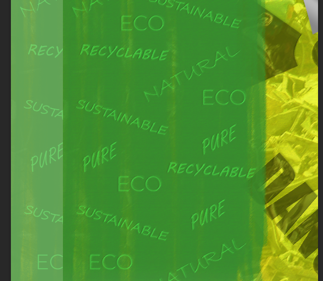
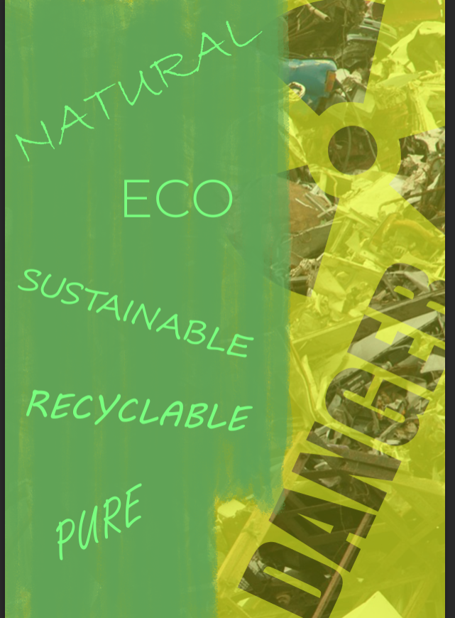
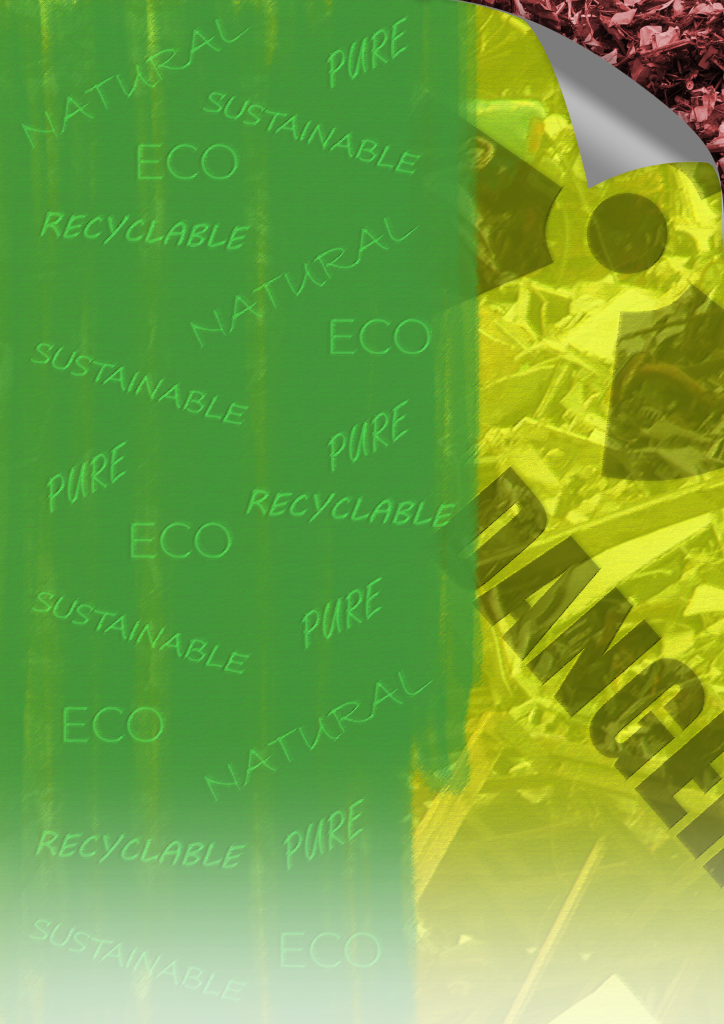
The magazine cover would need a background element to the illustration in front. In accordance with my original plans, I start to make an A4 page which displays the term ‘greenwashing’ and visually represents it. I start to put together a well-established way of communicating the issue, with green paint over a scene of pollution (the same landfill used within the hand of the illustration).
I continue developing the poster design to sit behind the illustration. I abandon the white blocks to help the text stand out past the green, and instead apply yellow, strongly representing hazardous danger over the top of the landfill image which serves more to add texture here. The paint brush is more directly linked to the painting, and I also add a page curl anticipating how it will serve to show that this backing image is a poster subject to greenwashing.
To bold text matches the green of the left side of the poster, and an unaffected grey on the right side of the poster past the green paint. To help the green text stand out, I duplicate the green portion of the text and place it behind in a bright green colour. This helps to improve readability even when heavily edited.
I adjusted the appearance of the poster overall with adjustments to the brightness and hue. I also apply a filter to the whole image to give the poster an aged, printed on paper texture. The filter slightly serves to blur it as well, to help an illustration over the top of it stand out.
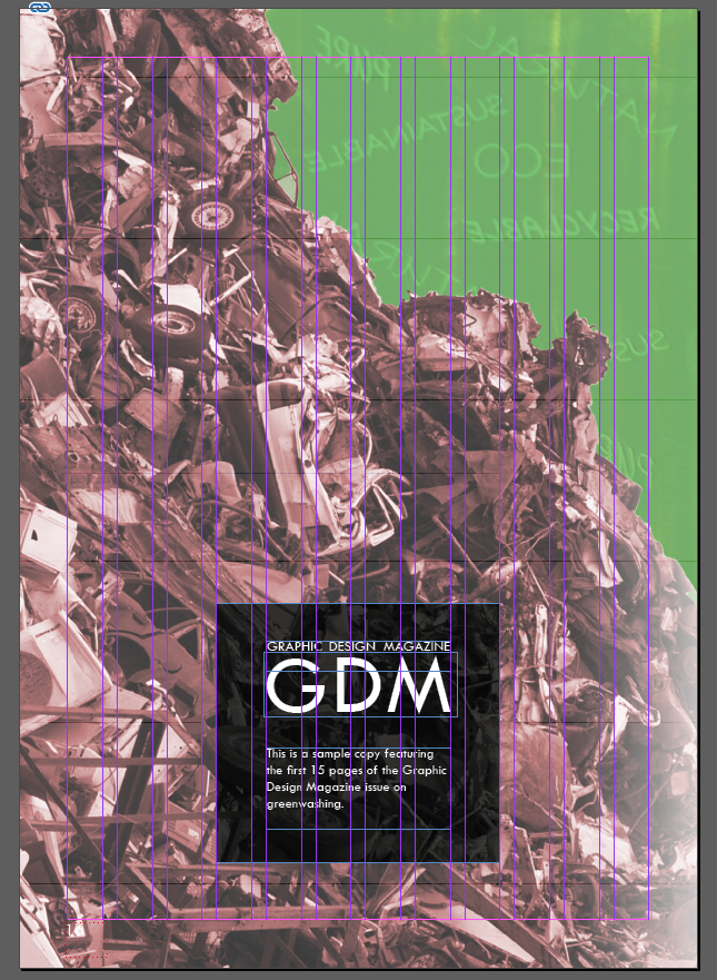
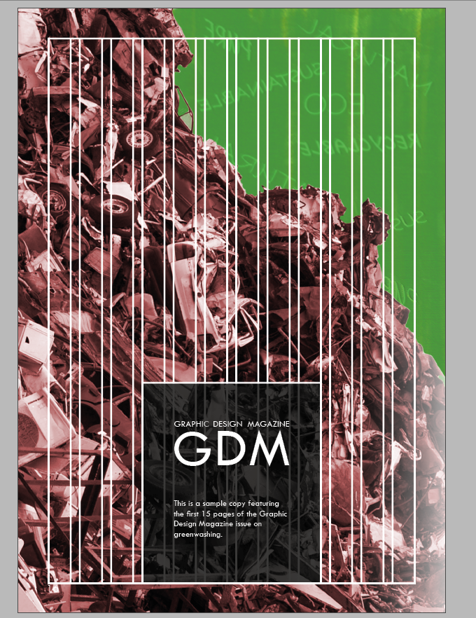
I apply the edited ‘greenwashing’ poster to the background, not stretched out to the edge of the page as in my original plan. However I notice some issues with this approach immediately. The way the edge of the poster meets the ‘GDM’ name at the top, does make this mark slightly less clear and hinder readability. If one were to design a logo with brand specifications, it would be made clear that these design elements providing a background to the logo would be unacceptable.
It is also clear that adding the paintbrush to the poster does not make sense. The paintbrush is supposed to be an object which is being used in an act of greenwashing, so making it a part of the background design suggests that this is a poster about greenwashing rather than a poster which is actually subject to greenwashing. Some changes based on these reflections are necessary.
I remove some of the editing from the poster, just to experiment with the result of keeping the background and illustration seem more connected with quite flat textures.
An important change here is that the poster fills the entire background, after I identified the issue with the edge of the poster conflicting the ‘GDM’ wordmark. The uninterrupted green background does help the magazine name to remain clear.
I also have removed the page curl and concept that this is a physical poster in the world behind the illustration. The result, however, appears too flat and basic. Bringing back some of the complexities in editing is necessary.
I apply a more edited background, along with page curls which expose the landfill pollution behind the poster. This helps to maintain some of the graphic design poster angle, whilst keeping the full page display of the background.
I add the paintbrush to the foreground alongside the illustration, rather than being a part of the background as it was previously. This makes sense to show the deliberate act of greenwashing, though the wording of ‘WASHING’ may be obscuring the paint as it meets the brush too much here.
I also applied a drop shadow and soft darkening outer glow to the foreground illustrations. This adds a mild sense of depth, though there certainly remains an overall flatness to the design – which may not be an issue considering many professional magazine covers had a simple flat design.
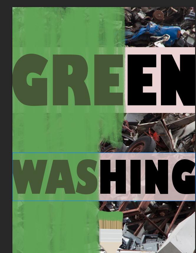
I had found with the previous experiments, that a major issue was the fact that the foreground illustration obscures the term ‘greenwashing’ too much. The illustration would have to be very small not to interrupt the readability of the word, which would limit its ability to draw attention to the cover. Another issue with how the wording was displayed, is that I had to separate the word ‘greenwashing’ into ‘green’ and ‘washing’ on separate lines. This could mislead audiences into thinking they truly are two separate words, which is not ideal for introducing the concept. And even with the words separate, the words still were not reliably readable behind the illustration as it was fully sized.
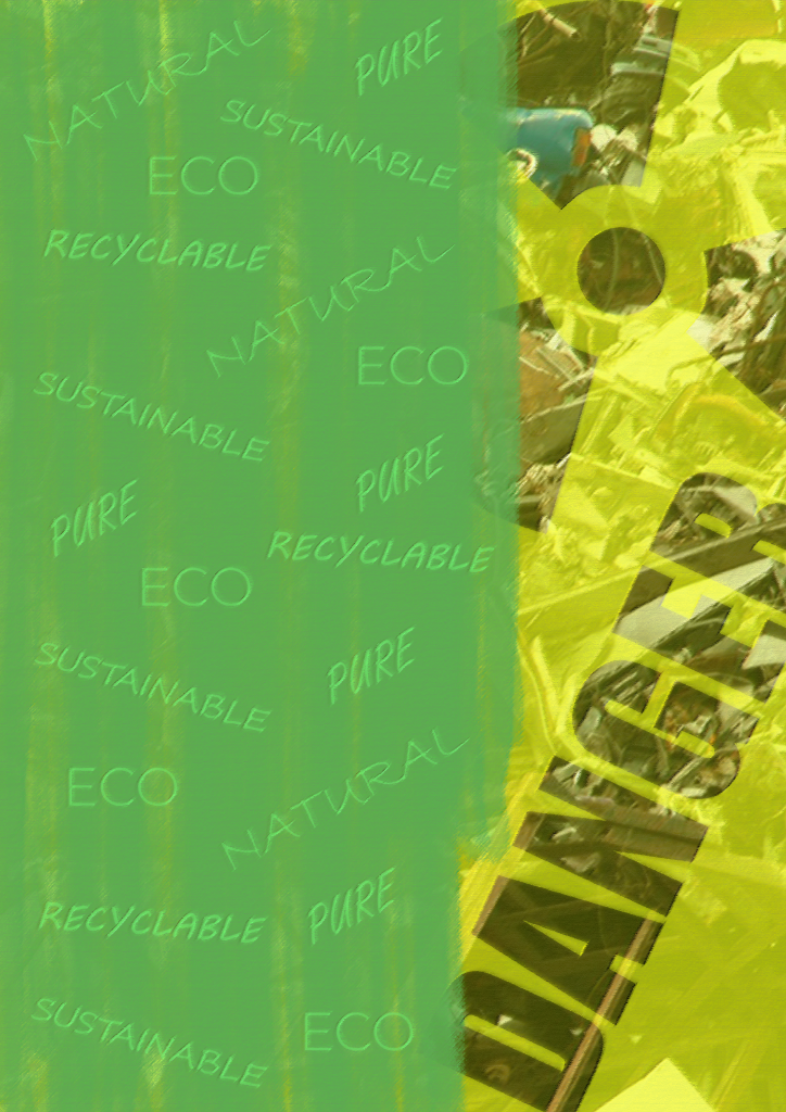
The concept for the background above, then removes the wording from the background and instead supports the greenwashing concept in a different way. I add some terms associated with the practice of greenwashing, in how companies use vague positive-sounding language to sell their products or services as green misleadingly. Light, mostly script style typefaces help it to seem like the text is a part of this deliberate greenwashing act.
The words on the green side would have been too clear and distracting from the main text on the cover in the previously discussed image, so the following version shown above has the words repeated and decreased in size, and blended into the edited version of the background. They appear like a part of the paint, and can still be clearly read without standing out too much.
I applied the foreground illustrations to the new version of the background here. It is a certain improvement that the illustrations are no longer obstructing the view of the important ‘greenwashing’ name for the issue.
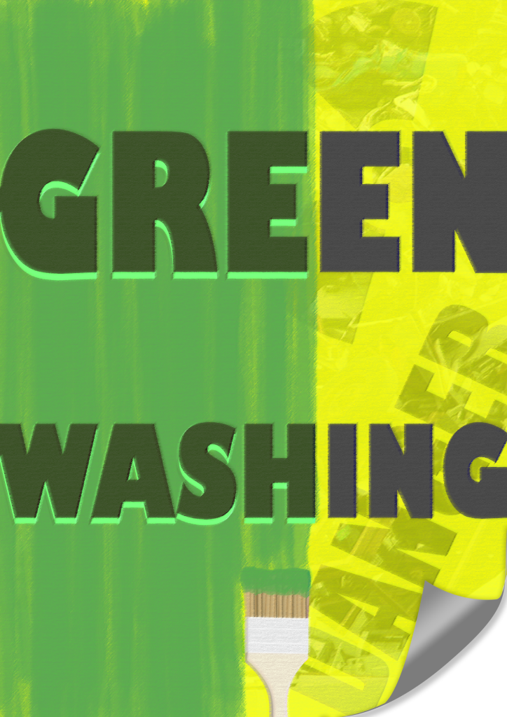
Instead I have applied the greenwashing title to the foreground, in the same style which changes from green to grey across the page in line with the divide between the green and yellow background. Having the word uninterrupted across one line is more appropriate with the intention to introduce audiences to the concept.
Another change is that I removed the page curl again, as I was concerned that there are too many visual elements competing for attention. I recognise, however, that this means that the concept of the background being a poster covering up pollution is less clear without the page curl, so the choice requires further consideration.
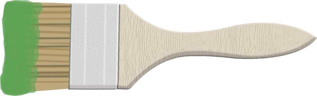
Focusing on the paint brush itself, I added some texture to the handle of it. The flat colour fill didn’t match well with the more detailed shading and textures of the rest of the front cover, so it is important to make the paint brush seem more like it belongs on the design. I also went back to the spreads to replace all instances of the paintbrush, with this textured version.
For the version above, I made the green section of the paint slightly darker so that it will be a slightly better contrast to the lighter green leaf. I refrained from making it any darker than it is above though, as I recall it needs to be enough of a contrast with the black ‘GDM’ magazine name. I also increased the contrast overall to help the words on the green, and the signs of danger on the right, stand out more for what they are included to communicate.
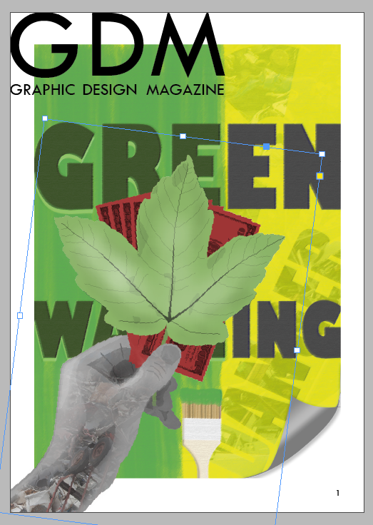
I re-added the page curl, just to the top-right corner. I found that it seemed like there was something missing from this part of the cover, since the top left area has the name of the magazine over the green, the yellow area at the top-right doesn’t seem to balance with it. The page curl helps to convey the concept of the front cover more effectively.
I made a few further changes for the version above. I moved the hand illustration out of the way of the bottom of the page. I found the hand illustration limited the power of the title text too much, as the darker and complex photographic element within the hand was a poor contrast for the dark title text. I still make sure that the tip of the leaf is in line with the ‘M’ of ‘GDM’, keeping the subject of greenwashing linked with the name.
Moving the illustration out of the way also gives more space to the paint brush to be more clearly seen to be linked to the paint effect on the background, opposite it with the same drop shadow effect. Moving the illustration out of the way exposes the clear divide in the background and plays into this as an element that divides the cover from top to bottom, taking better advantage of this choice in the background.
A soft faded white brush at the bottom of the page has significantly helped the ‘Greenwashing’ text to stand out with strong clarity, whilst not being a problem in covering up any part of the design.
Another key change is that the name of Graphic Design Magazine has been moved away from the edges of the page. Whilst the choice to push this right to the edge was inspired by some professional examples, I concede that the thin text (the full name ‘Graphic Design Magazine’ and not the ‘GDM’ acronym) could be obscured too much when printed if it stays at the edge. I recognise that in printing, the very edge of the design will start to wrap around to the spine, and the very top of the design would potentially get clipped off slightly more in printing. It is the safer choice to move this away from the edges, with the middle of the ‘M’ still marking the halfway mark on the page area.
This final version clearly displays the visual elements that it needs to. It uses well-established ways of communicating the concept of greenwashing, and utilises a bright yellow and green colouration to grab attention. It is appropriate in how it links to the design of the spreads that would be inside with the use of the same typeface at the top of the page, and the same paintbrush visual. This version should not be significantly changed for final submission, though further minor edits may be necessary.


