With an appropriate version for the introductory left page of the spread, I set to designing the list of contents for the magazine. This page would require less visual elements than the complex left page, but need to be designed in a way that fits the other pages in the magazine.
I turned to various examples of how other magazines displayed their list of contents. Many magazines have a lot more contents to list in a small space than this magazine does. They also have more photos to display typically as their content relates to people; this magazine requires a different approach from most prominent examples.
I take inspiration from how this uses bold colour choice to bring attention to this spread, without any detailed visuals. The page uses bold, evenly sized numbers set over two columns as a clean structure to the page. Boldly displaying the page numbers is a choice that makes sense for quick navigation to relevant topics that the reader might be looking for specifically.
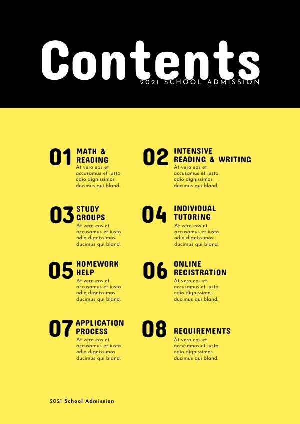
This example does feature photography, but these are simple relevant photos that don’t take the focus of the page as a whole as a centrepiece of any kind. This also shows even large sized page numbers with bold text to be clear and easy to use for navigation. There is structure to the even spacing between each number and corresponding text, and this fits in a box below the heading.
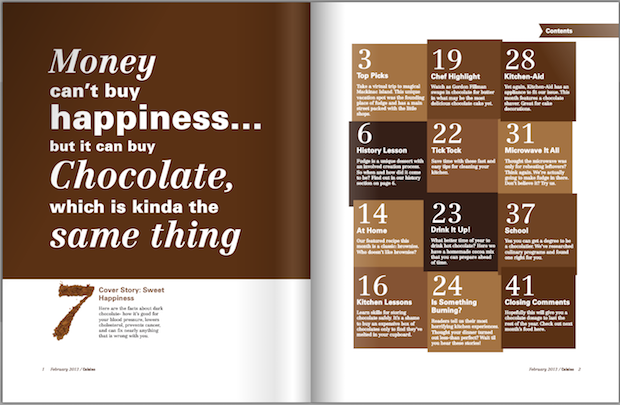
This is an inventive, intriguing way of displaying contents without photography or illustration. Shades of brown relevant to the subject of chocolate are an effective way of keeping this page linked to the appealing subject of the text. A sense of luxury and indulgence comes through with the serif numbering, clearly showing how the choices of typography for the magazine remain important for the content page. The use of boxes here keep a large amount of text palatable and well-separated, where this would be a very ineffective spread if the text was black and had no boxes.
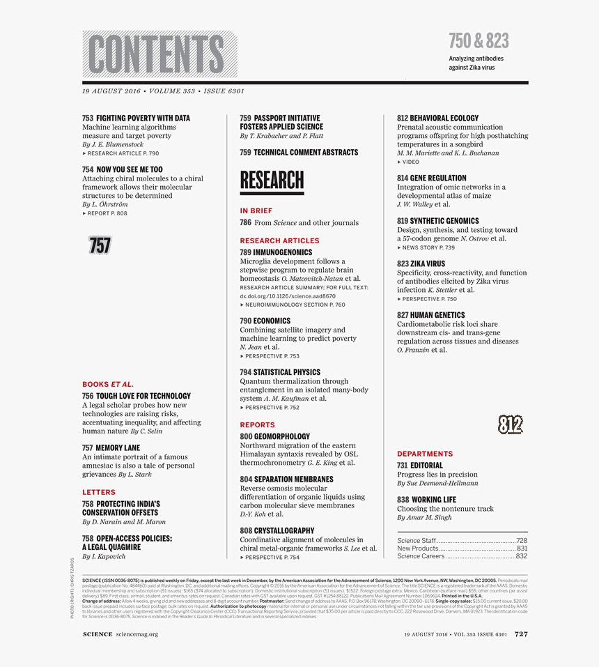
This content is very neatly arranged, using the full page space to display a lot of information. This page likely won’t pull in much attention, but for an academic audience it’s relevant to, this is a neat way of displaying all important information with ease of navigation, using bold text and line structure in this regard.

In listing contents, an issue emerged. My brief that I have produce spreads for is for a sample of spreads for a larger magazine. The contents page of a final version of this magazine would have more content than I have designed. Whether I should design the contents page to guide what I have designed, or also include what could be included further past this, is not a clear choice. I make a decision on this further down.
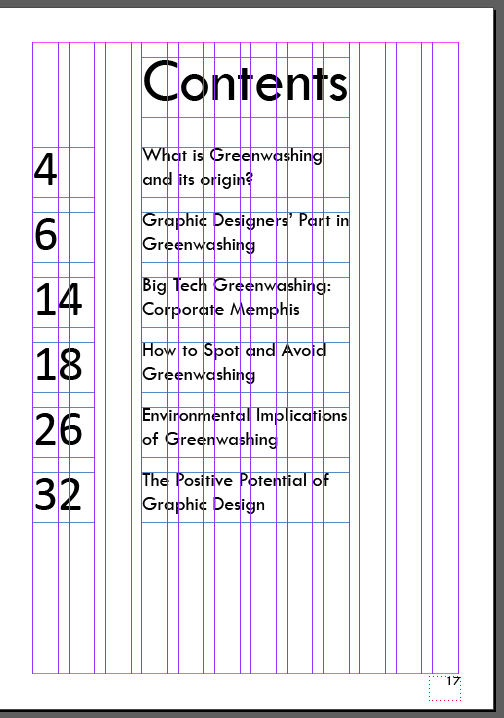
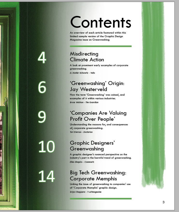
With inspiration in mind, I start out with a simple list structure given how limited the number of contents I need to place are. I use large numbering as I saw in other examples, adjacent to each corresponding listing. I list the beginning of each featured article, all using the magazine theme Tw Cen MT typeface.
Here I start trying out the approach of making up what content could reasonably be expected to be included in the magazine past where my spreads end at page 15. I considered the briefed message of reaching people about what greenwashing is, the environmental harm of it, and the complicit role that the graphic design industry has in it. The headings for potential content past page 15 all relates to this. The heading changed to just ‘Contents’ rather than ‘Sample Contents’ to reflect this this listing would cover the whole magazine. Research indicates that a magazine of less than 40 pages is shorter than the typical publication, but in no way unrealistic or unheard of.
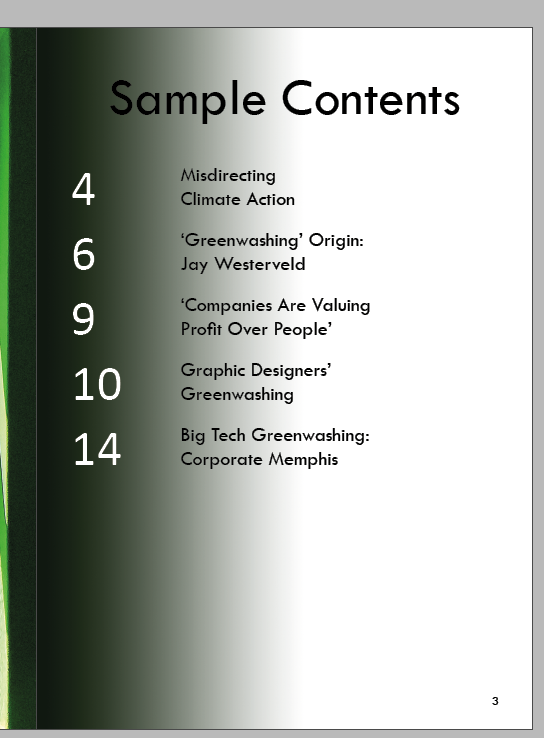
Switching back to listing only the content that I have designs for, I add a dark gradient from the left. This is intended to match up with the edge of the image on the left page which is a very dark green colour. Fading into the light colour on the contents page is a way of keeping most of the right page surface light, for readability with the black text, whilst also keeping the two pages connected. Using white letters as a contrast to the rest of the text could also add some visual interest.

I add a large green paint stroke here. It’s placed on the left as a barrier at the gradient, as a way to frame all the numbers. Using a green paint stroke keeps this spread connected with the rest, as I frequently use this visual for simple communication of the greenwashing issue.
It is at this point I decide to stick with only listing the content I have designs for. Adding more of a description to each listing will give readers a better idea of what each part entails, which would be important for those of the audience without much familiarity with the subject matter. It also gives proper credit to each of the authors I have sampled text content from, which is not something I could add for content listings which I have not designed and selected text for. To account for this choice, the description beneath the heading explains the concept that this, and the contents listing, are for a sample copy of what would be a larger magazine.
12 pt text is used for the descriptions of each listing, and 10 pt text is used for the author credits – these sizes are appropriately small and still reliably readable. Adding this fills out the page, whereas the page previously seemed too empty and as though it was missing some content.
I moved the paint stroke to the right side of the page. I found that it was difficult to centre the numbers within the paint stroke area, so the result was not as visually effective as where the numbers are just placed at the edge over the dark gradient area. Moving the paint over to the right helps to make the page more balanced, as it seems to mirror the dark gradient on the left side in a subtle way. This balance is effective for framing the contents text which is arranged in the centre of the page.
I made some changes to make the page design more effective. Adding green lines to sandwich the list of contents, helps to make this listing seem more organised. These lines stretch to the middle 6 (out of 12) columns in my layout structure, as do all the text boxes around them.
I also added a green stroke to the numbers, the same stroke used on the green lines. It was just a subtle choice to add some visual interest which seems more visually effective than not using the stroke.
Another important change above was I paid close attention to the line spacing on the page. I made all the two content heading lines closer together, and the first description line of each listing further away from the headings. These subtle changes to the arrangement of the typography are important to take the time to consider, especially considering the graphic design audience it aims to reach.
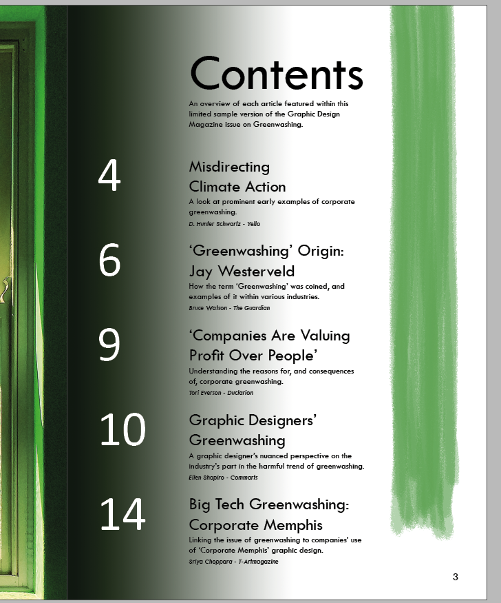
Above I show a look at my process of replacing the gradient on the left side of the page. The gradient was always intended to match the far edge of the window image on the left page. Copying a solid colour was not able to match this look, however, since the window edge is a grainy dark green that very slightly varies in colour.
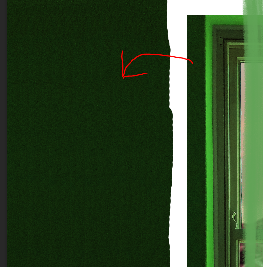
My solution to this was to instead use the clone stamp tool to take directly from the window edge on the left page, and carry that over to the right page. From there it is a careful process with a very large, 0% hardness, very low opacity eraser tool to gradually remove some of the clone stamp filled area, until the result is a gradient effect that matches the window on the left edge of the page, and is light enough before the start of the black text of the content listing.
The gradient effect using the grainy dark green from the edge of the left page is visually effective here. It keeps the pages connected as intended, carefully fading into the white background where the green paint stroke is a strong contrast.
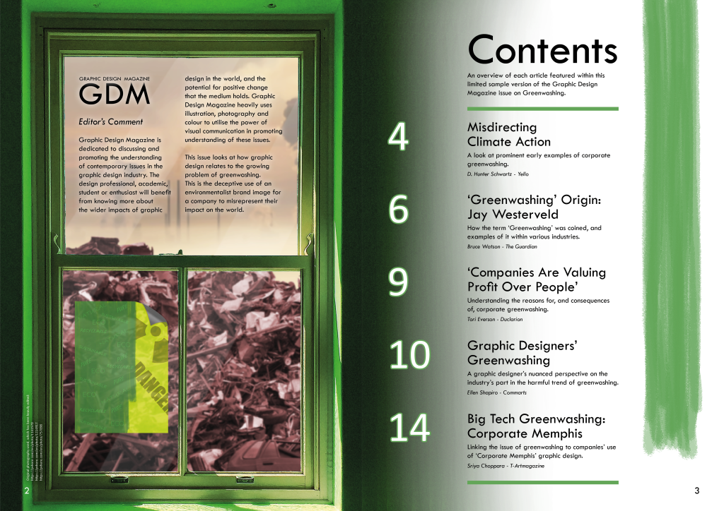
Here is the spread with some slight adjustments to the left page following from the previous post. I decided to create a version of the backing poster on the window, with the half-painted green cover over the yellow, but without the landfill texture as this is taken from the background. I switched back to not using a fully green version since I find it could be a lot clearer that this connects with the front cover this way.
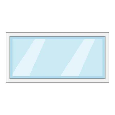
Additionally I added subtle light blocks diagonally over the window area. I was concerned that it might make the concept that this is a closed window not believable, to have no glass overlay effects on the window. I took some inspiration from existing glass pane photos and clip art, such as the image further up, to see how to represent a glass pane visually and simply. The diagonal bars match what is often used to visually convey that there is a pane of glass, and the result I added is subtle so as not to distract from or obscure what is behind the window.
This current final version of the post may change slightly before final submission, but overall I am satisfied that it fits in with the rest of the spreads I have designed, and introduces the topic of greenwashing with some interesting visuals.
