As the pages for the spreads are numbered in order, I find it would be in line with professional practice to include an accurate opening spread. My initial first spread begins the text content on Greenwashing, but before this, an introduction to Graphic Design Magazine and a list of the magazine’s contents are in order.
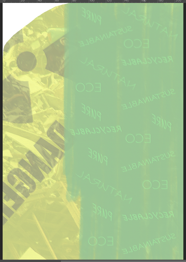
I start by thinking of ways that the first page past the cover could mirror the front cover in some way. I start by taking a literal approach to this, by reversing the backing poster to the front cover, as if seeing the reality behind it. The poster is intended to represent the way that greenwashing acts as a cover of companies’ environmental harm, and the information in this magazine then brings people to see past that cover. To start this, I add a light overlay to the reversed image and remove the page curl, to try and accurately capture the effect of seeing behind.
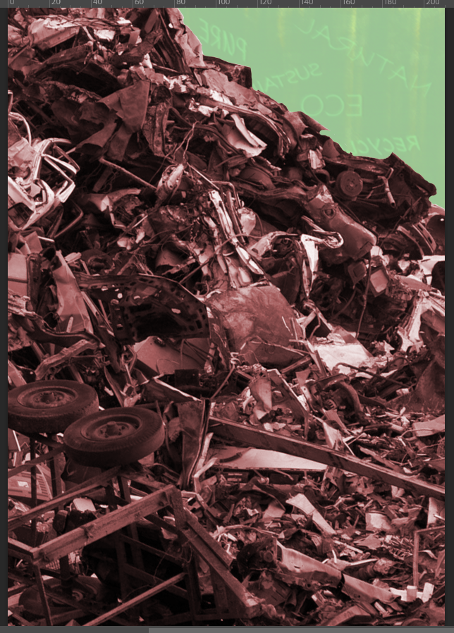
The cover’s backing poster was covering up evidence of severe landfill pollution, so here I bring in that same unsightly image of the metal scrap pile with a slight red hue to emphasise its harm. This should, in a way, force the reader to confront the kind of environmental harm that greenwashing should be associated with for covering up.
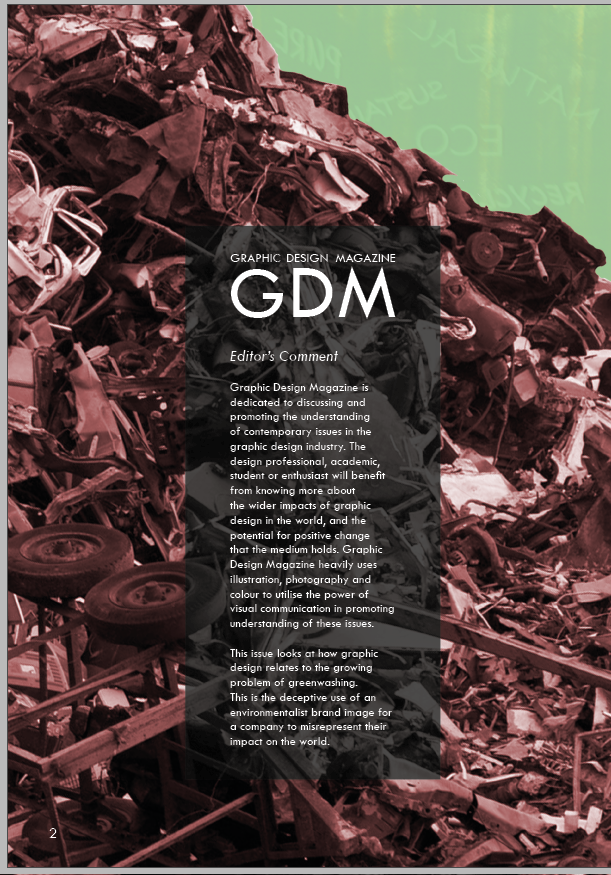
I use a lowered opacity black box to sit a description about Graphic Design Magazine and this issue on greenwashing specifically. The box is a mild contrast to the dark background, necessary to be sure that white text could have appropriate readability. I use the same typography for the magazine as seen on the front cover, and limit the box to sit within the centre 4 columns of the page. The text reads:
Graphic Design Magazine is dedicated to discussing and promoting the understanding of contemporary issues in the graphic design industry. The design professional, academic, student or enthusiast will benefit from knowing more about the wider impacts of graphic design in the world, and the potential for positive change that the medium holds. Graphic Design Magazine heavily uses illustration, photography and colour to utilise the power of visual communication in promoting understanding of these issues.
This issue looks at how graphic design relates to the growing problem of greenwashing. This is the deceptive use of an environmentalist brand image for a company to misrepresent their impact on the world.
I took time to carefully consider how the magazine is relevant and appropriate to the mostly graphic design concerned audience, to land on the text content above. I also give some justification for why many of the spreads have such prominent visualisation, with many full-page photographic-illustration pieces, about fully utilising the visual medium.
The introduction to greenwashing is very brief, as the following spreads also take the time to introduce the topic for those not yet familiar with it.

I was somewhat dissatisfied with the resulting page introducing the magazine. I felt the reflection of the concept wasn’t coming through well, and may not be noticed by the audience at all. Placing a full-screen sized poster behind the pile of metal waste also didn’t make any sense, which might be a problem if I made this placement more obvious since I am aiming to engage audiences with very real issues.
I decided to consider changing directions, reflecting an aspect of the front cover in a different way whilst implementing some similar imagery. My first step above was to manually remove the background from the metal pile above, since the automatic background removal was unable to make the desired change. Removing the sky background to the pile makes the image more versatile, to be placed on a full-page illustration with as much clear space above the photo as needed.
https://pxhere.com/en/photo/1214917
My idea for this second concept is to zoom out on the front cover’s backing poster. This would be to place the poster on a window in front of the metal pile, which would explain why the pile is visible past the poster as the poster peels away on the front cover’s top-right corner. I sourced the CC0 free use image above to begin putting this concept together.
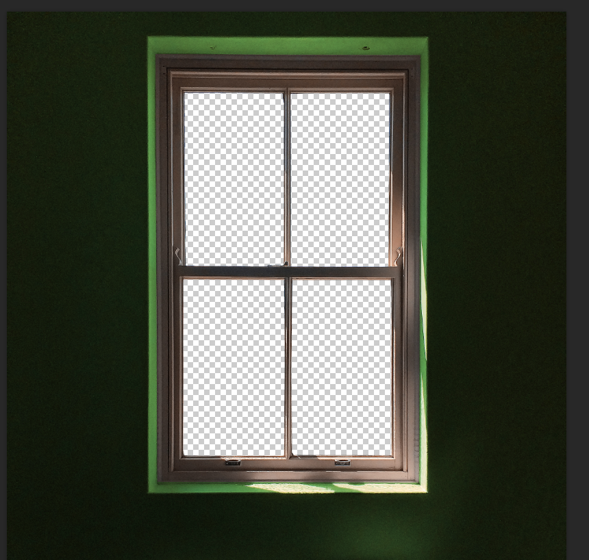
I manually deleted the window area as intended, so that I can then place the metal scrap pile behind the window to be the view instead of a window cleaner.
I added a green overlay to the wall paint to help to convey that this space inside identifies with a green image, which should be viewed in contrast to the unsightly scrap pile in view outside.

Here I place the original version of the backing poster on the window area, with the scrap pile behind. The concept of zooming out from the framing of the front cover to see around the poster is intended here, though some work would be needed to help the poster to seem more like it belongs there, conveying some depth.
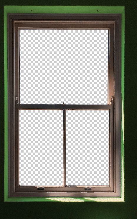
Anticipating that I would need to place the text inside the top half of the window, I decided to remove the bar in the middle of the top, with careful use of the eraser and using the clone stamp tool to correct the window bar at the top.

I decide to replace the half-painted version of the backing poster with a fully greenwashed poster. The concept is that the inside view might be of seeing the poster after the painting has finished; the paintbrush is no longer over the poster, so the painting is implied to have finished and leave no yellow warning area showing. The logic to this change does come at the cost of making it different from what is seen on the cover, so it might be that audiences wouldn’t link this to the cover. This may not be an issue, though, because the poster shows a green cover-up with vague language in contrast to a scene of environmental harm outside the window.
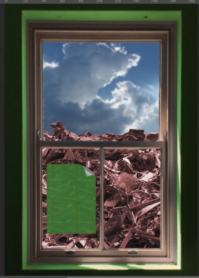
The parts described above come together with the version above, showing the greenwash poster on the window with the waste behind, and a sky photo inserted above it: https://pxhere.com/en/photo/1009618
Thinking about how to convey some depth, my approach above is to blur the foreground and focus on the waste out the window. This can link to how the content of the magazine invites people to look past the greenwash. The consequence of this, however, is that the greenwashing text on the window poster is no longer readable.
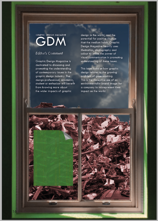
I apply text summarising Graphic Design Magazine and this greenwashing issue, the same text content as was seen in the previous version further up. Removing the bar from the middle of the upper section of the window is certainly necessary to fit the text without making is smaller, as it’s a tight fit. The window frames the text well, however. The text fits into two columns and uses the space of the window effectively.

My next change is to sharpen the metal waste pile in the background, to make clearer the photographic effect that the focus is on the background, explaining the strong gaussian blur on the foreground elements. I appreciate how this really invites the reader to look through the window and find it effective for the meaning of the greenwashing text to look past the greenwash.
Issues seem to remain however, with how the poster cannot be read, but must be blurred as it’s a foreground element. Also, the text doesn’t have perfect readability since the sky background is not dark enough or light enough to sit either black or white text perfectly. It’s darker than it is light, which was intended for the sky not to be a perfectly sunny day as this would seem too positive. I can’t make the sky darker than this however, since there is clearly light coming through the window and the sun is out – it would be out of place for this to be much darker. Still the dark glow around the text isn’t quite enough to surpass all readability concerns.
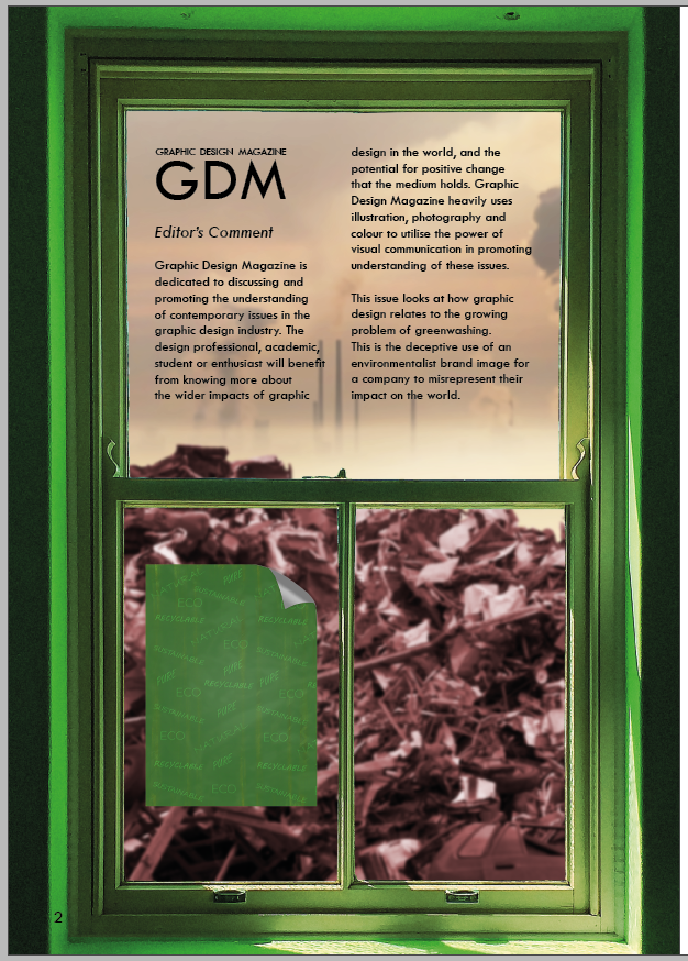
I find a new photo to use for the sky backdrop. This is light enough to sit black text, which is preferable for readability over white text. The lightness makes sense of the light hitting inside the window frame, but doesn’t have an unfitting positive connotation of sunlight; it’s a lightly coloured cloud with visible sources of air pollution.
I also change the approach with creating a sense of depth. I instead turn focus onto the foreground, and blur the background. The risk with this approach is that it wouldn’t be clear that the background is a harmful landfill. However I find that even with a heavy gaussian blur, a negative sense that the background contradicts a green image is clear, which is helped by also having pollution visible in the sky.
The window frame and green poster are now clear, which brings back the benefit of being able to link the poster backing the front cover, to this on the first page inside. Another concern I had with blurring the foreground was that somehow the photographic effect would not be clear when printed in A4, that it would look like an unprofessional error on my part that there was this blur. It should be clearer that the blur is deliberate since people may expect more to see a background blurred and have attention drawn to the foreground.

Still considering that there is merit to having the sharpened view of the metal pile in the background, I experiment with having the ‘best of both’ with half of the page blurring the foreground and the other half blurring the background. I quickly realised that this will be too distracting however. It’s such an unusual effect that people will wonder what the significance of implementing it is, and thus will take away from communicating the issue of greenwashing.

I have some extra changes above, sticking with the approach of focusing on the foreground with a blurred pollution in the background. I switch to the B-master on InDesign, with white pagination as a stronger contrast for the green in the bottom-left. I also add image sources in accordance with professional practice.
I also add a soft white glow around the text, since I still had concerns that there could be slight readability issues for the text against darker parts of the background, especially considering the design could display colour slightly differently when printed. The glow is intended to aid readability without becoming a distraction.
I next need to move onto the right page adjacent to this left page on the spread, which lists the magazine contents.
