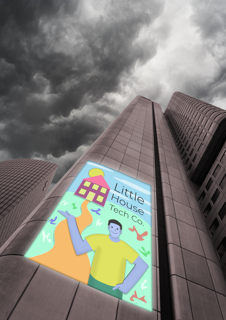
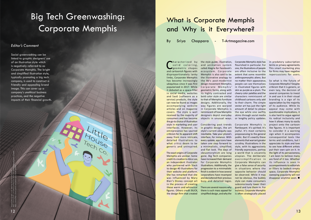
With a version of the main image at hand, I consider more about how the image will be placed on a spread. I had in mind that it would take up the entirety of one page, away from most of the body text, since it holds A4 dimensions.
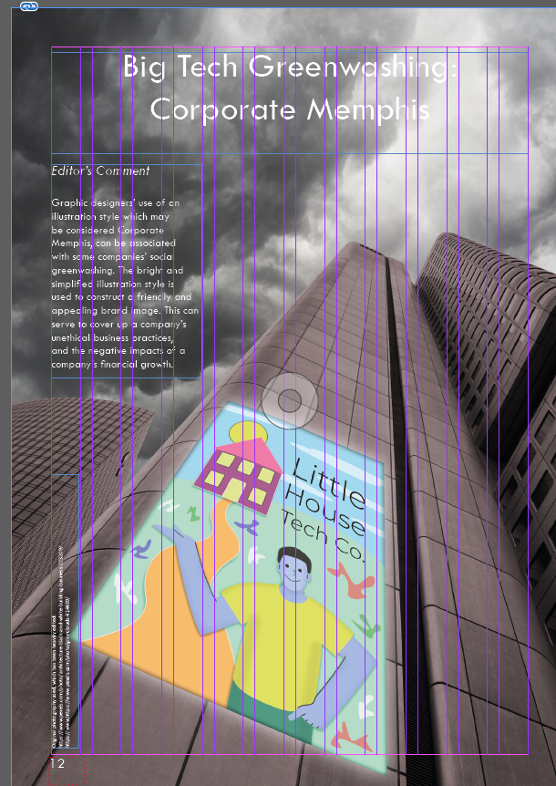
I set the image on the left page, where the image credits can be placed at the bottom-left corner, so that the right page can have undisrupted space for body text. I place a heading at the top of the image to introduce the concept of Corporate Memphis and its place in the discussion of greenwashing.
The headline however likely does not provide enough context for the image, and I know that the article that will be used on the adjacent page will not clearly outline the link between Corporate Memphis and greenwashing. Therefore I briefly outline this in my own ‘Editor’s Comment’ to the left of the page, out of the way of the buildings. I took care to make the text clear and short enough to fit within that space on the page at 12 pt.
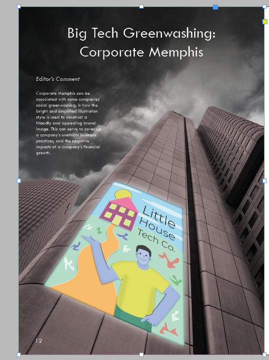
The previous version of the page raised issues of readability, since part of the heading was difficult to read as the white text was set on a bright part of the background. I add a light black brush over the top portion of the page, acting as a natural gradient which doesn’t distract from the look of the cloudy sky and the image as a whole.
I also found that darkening this area enhanced the ominous, negative atmosphere to associate with the ‘big tech’ buildings, so proceed to consider if this should be taken further.

Above is the final version of the left. I make the sky darker to enhance readability of the editor’s comment, whilst not going too far with this to keep the cloud formation visible.
Further editing was done to the image, with a light grey brush applied near the top of the buildings. Obscuring the view of part of these buildings serves to enhance the mysterious, almost threatening presence of the buildings. I carefully erased part of the top of the building which is obscured by fog, to complete the appearance that the building is so tall that the top cannot be seen.
I moved the buildings and Corporate Memphis poster, slightly over to the right to clear more space for the image credits at the bottom-left. It was more of a distraction to have the white text right up against the edge of the Corporate Memphis poster. I added a subtle dark glow around this text also, so that it is readable against the background.
Finally I made changes to the ‘editor’s comment’ text content, with minor re-wording and clarification. The final text as seen in the image above is as follows:
Social greenwashing can be linked to graphic designers’ use of an illustration style which is negatively referred to as Corporate Memphis. The bright and simplified illustration style, typically promoting a big tech company, is used to construct a friendly and appealing brand image. This can cover up a company’s unethical business practices, and the negative impacts of their financial growth.
Right Page
With the main image and introduction to the concept of Corporate Memphis in greenwashing on the left page, the right page needs to contain all of the article text taken from t-artmagazine.com. This text-heavy page should contrast with the mostly dark left page and neatly arrange the text to not be off-putting and overwhelming to the reader.


I take in a lot of visual inspiration on what a Corporate Memphis style background could look like. The most defining features of Corporate Memphis are figures of people with simplified features, and in many cases blue-pink skin tones with oversized limbs. These tend to be placed over backgrounds with mostly solid colour and background features that lack depth, promoting whatever a company finds relevant about what they offer. The text on greenwashing points out ‘geometric shapes’ as a key trapping of Corporate Memphis, so using these would make sense when I’m not aiming to show any specific items.

I start by placing simple shapes on an A4 area, with various block colours and limited opacity. I keep the use of geometric shapes in mind, and start to build up a page that looks like it would be a fitting backdrop for an illustration that would be negatively called Corporate Memphis.

I lean towards adding more warmth with a warm yellow background. This is to increase the contrast with the dark, quite cold feeling image on the left page. This warmth would be used to help construct the friendly and inviting brand image that can be criticised as greenwashing. I also control the opacity of some of the various shapes more, and fill the page with a somewhat even distribution of shapes.
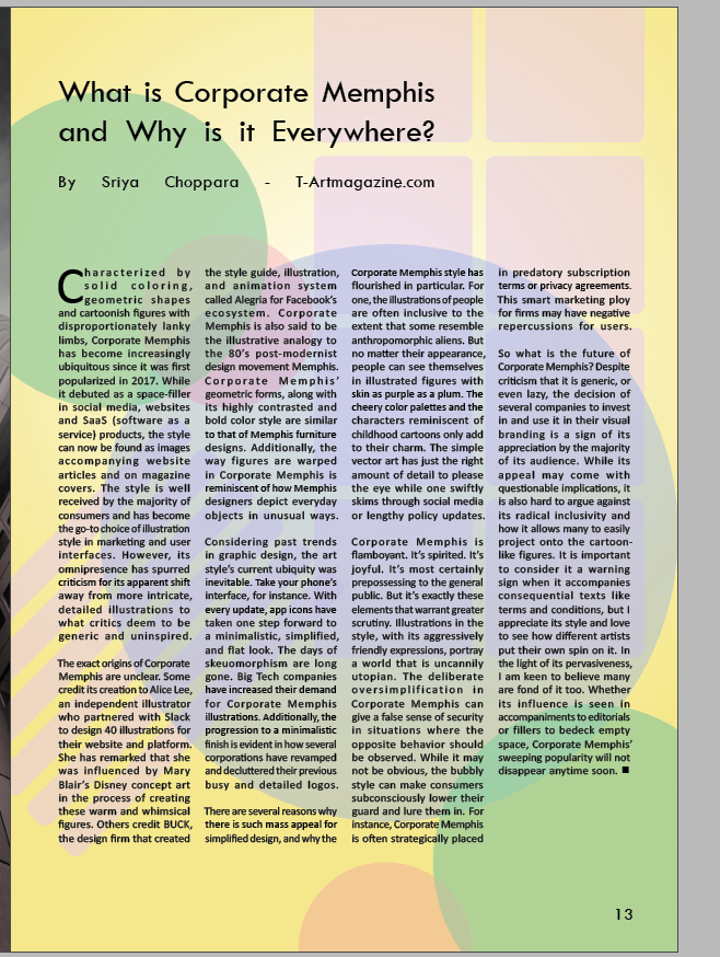
I now insert the body text with the article’s heading, and it takes up 4 columns across using the same typography choices as in previous spreads. This makes it clear that this approach to focusing on a background illustration is appropriate, and going further to add another foreground element might make the page too busy, especially when aiming to draw attention towards the main image on the left page before they take in this information-heavy right page.
I find that the coloured shapes are slightly too vivid, and not light enough to assure there are no issues with readability for the small black body text.
Adding a light overlay to the background shapes brings the page to a point where the geometric shapes typical of Corporate Memphis come through, but are muted enough to hold the text as needed. I also add an extra shape to the bottom-right corner and move the circles over to the left, so that there are no clear spot that stands out, keeping the background balanced.
The resulting spread has a strong colour contrast between the two pages. The issue of Corporate Memphis as is relevant to the text content is clearly visualised, and should first invite the reader to the image on the left page which introduces the term and its link to the content on greenwashing in the previous spreads.
