Having found a point of interest in the trend of Corporate Memphis from previous research, I decide it would be valuable to include a spread which features this issue for a part of the sample of the Graphic Design Magazine issue on Greenwashing.


I searched for text which gives a brief summary of what corporate Memphis is, which touches on how it can serve as a visually positive cover to harmful business practices in a similar way that design can be criticised as Greenwashing. I found this article provides that summary which could comfortably sit over one spread: https://t-artmagazine.com/what-is-corporate-memphis-and-why-is-it-everywhere/
I identify a way of directly naming Corporate Memphis as a type of Greenwashing. Articles are clear that the illustration style is associated with tech companies, and is often attributed to tech giant Facebook.
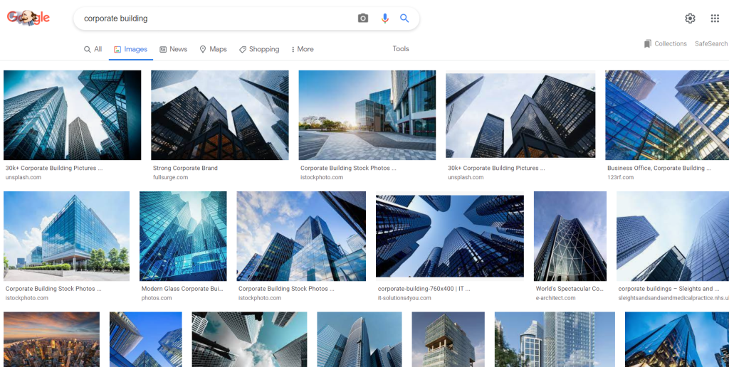

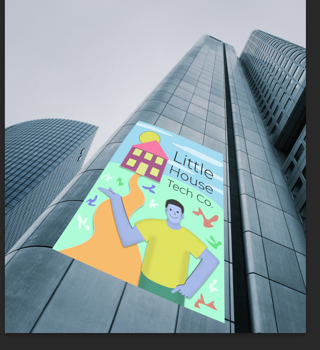
To visualise the concept of Corporate Memphis as big tech Greenwashing, I search for high-rise/skyscraper buildings that have a dark, ominous quality to them. Tech companies would be known for having headquarters in this kind of building, and for the purpose of showing that there can be negative impacts of these companies (invading privacy, contribution to the climate crisis), clear negative connotations should be attached to the big tech building.
https://www.pexels.com/photo/architecture-black-and-white-building-business-273209/

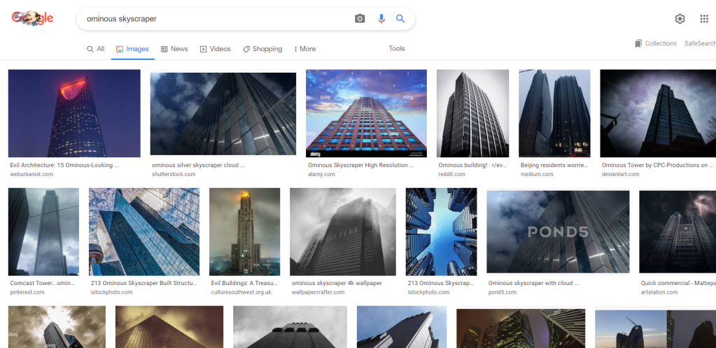
The above CC0 Free Use image is ideal for its dark exterior, and that it offers a clear wall to attach a corporate Memphis design to. The concept is to put a sign on the wall which represents the company that uses the tall, uninviting building. This building using a corporate Memphis design as their front brand image, is to provide a fictional and exaggerated example of how the light corporate Memphis illustration may have a far darker impact behind it.

To start to illustrate a person in a corporate Memphis style, I use a figure of a person as a rough guide, from which I will extend the size of the arms and work towards a more unrealistic corporate Memphis style. I chose this person because their body language is inviting, and their right arm could be used to show the person upholding the brand name or image, keeping the person closely linked to a corporate identity.

I continued developing the illustration with the vector style pen tool shapes technique I used for others, to create a simple style which can be recognised as corporate Memphis.
In particular, to exaggerate and match the typical corporate Memphis illustration, I use brightly coloured clothes, a blue skin tone, and bring out the large limbs.
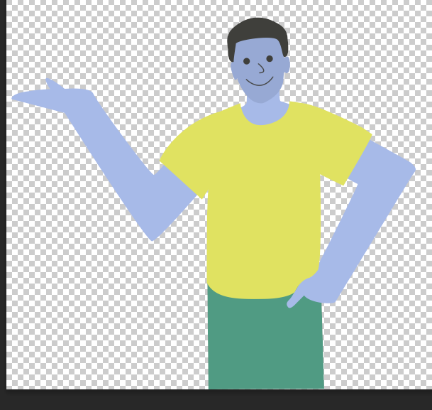
Research into the style leads me to use simple curved lines to represent the nose and mouth, and solid circles for large eyes. The friendly looking corporate Memphis person is devoid of any discernible unique facial features, as intended.


To add some effective extra touches, I add lines to certain parts of the person, and softly shade in the sides of the person. I was inspired by other examples of corporate Memphis to add these extra touches, which still leave the illustration very basic.

As intended, I place the Corporate Memphis figure onto a poster size page and add simple visual elements to create a scene to associate a tech company with the style.
The name ‘Little House Tech Co.’ was inspired to directly contradict the large building the design is placed on. The fictional Corporate Memphis poster directly misleads audiences who would assume this company is of a modest size and operates on a small premises. To place this design on large skyscraper would be clearly contradictory, and thus in line with the worst greenwashing practices which should be criticised.

I add more details to the poster whilst maintaining the simplistic style intended. Simple shapes to represent the sun and some clouds make a basic, positive scene, but I refrain from making things too spirited and joyful as it needs to be a glaring example of Corporate Memphis rather than being a fun, childish setting. Some coloured shapes are added around the grass just to bring in some of the colour range that can be seen in this illustration style, which will frequently use small motifs/doodles like this. I also added some more outlines and subtle drop shadows to add a little visual variety where it does not distract.
I used the warp tool to place the Corporate Memphis illustrated poster on the previously selected skyscraper image. The structure of the building serves well as a natural guide for placing the image at a size and angle that looks like the poster is attached to the building. The image is immediately a contrast to the dull appearance and towering height of the building, but further edits are needed to bring out the ominous atmosphere intended to be associated with the setting, and to make the poster really seem to be a part of the wall.
https://www.pexels.com/photo/gray-clouds-414659/

I quickly identify that there is a missed opportunity for the image in having a clear, dull sky above the skyscraper. In search of a sky that would be more appropriately negative and atmospheric, I find the cloudy image above with a varied stormy appearance that may help to add to the sense that the corporate building is not appealing or innocent.
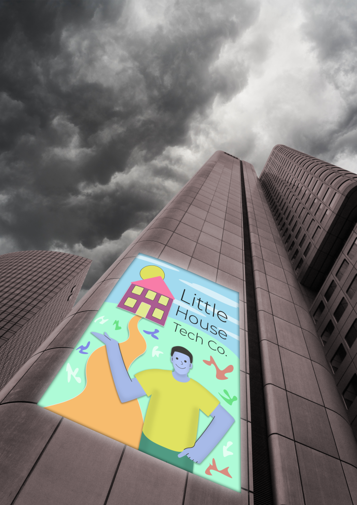
I cut out the sky from the skyscraper image and insert the sky. The angle of the sky in the frame makes it seem like the clouds could have been an original part of the building photograph, so the sky is not an unfitting distraction and makes the overall image more effective.
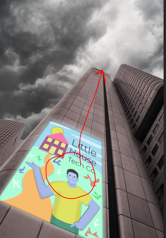
I reverse the image so that the bright spot in the sky appears over the main skyscraper which extends up towards the right of the image, to help to draw the attention which should immediately go to the Corporate Memphis poster, to look up along the extending building towards the sky.
Following, the image needs to be placed as the main visualisation for the spread on Corporate Memphis, and edited as needed to effectively support the text content and invite audiences to understanding how this connects with greenwashing.
