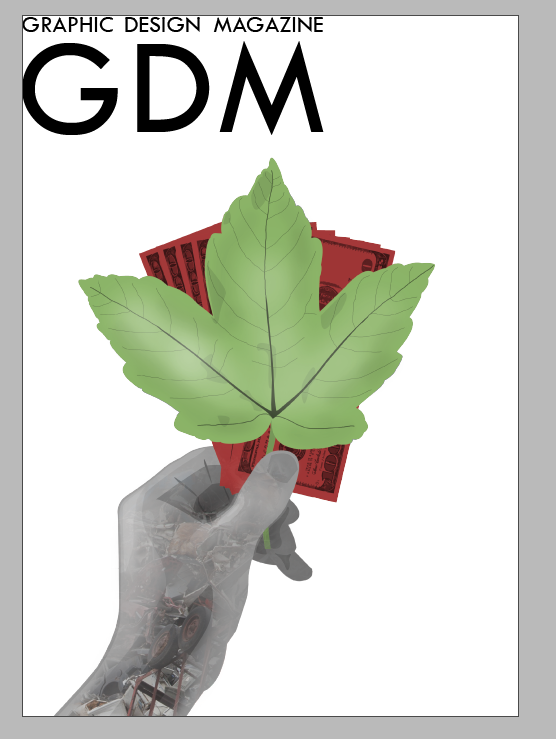
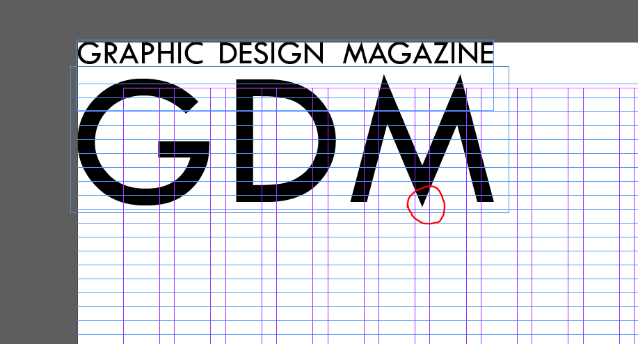
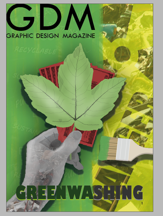
The illustration intended for the magazine cover is applied to an A4 area above. I started, as well as the illustration, with the acronym name for the magazine. My brief states that a graphic design magazine is the client, so I applied this simple name with an appropriate short acronym. I used the same Tw Cen MT typeface for this, to match with the design across the spreads. In moving and resizing this, I found it could be effective to have the middle of the ‘M’ in the middle of the page, as a subtle way of reinforcing some structure to the page. I find it visually effective to have the tip of the leaf reaching up to the middle of the ‘M’, as it draws the eye between these two elements; making note of the magazine name, and understanding the focus of greenwashing.
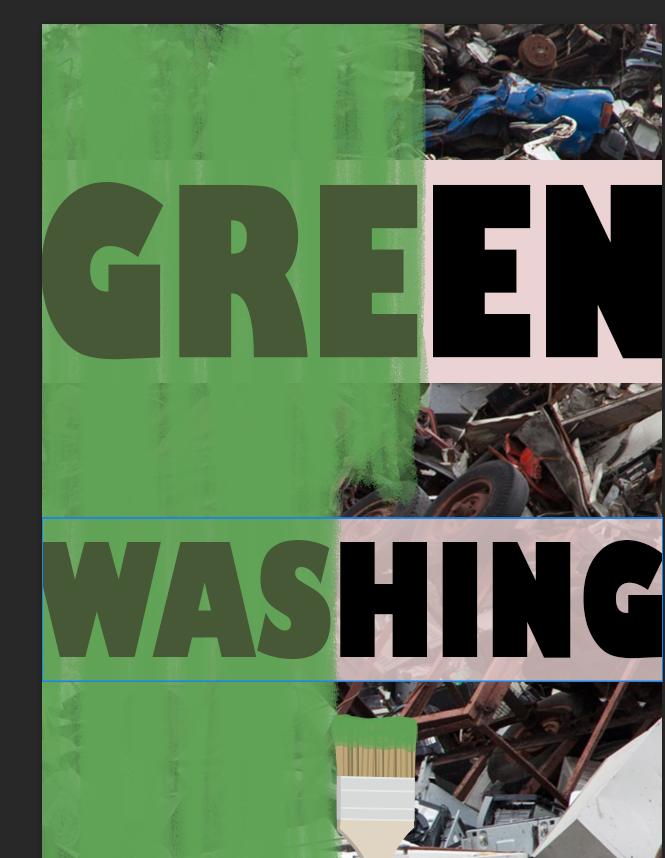
The magazine cover would need a background element to the illustration in front. In accordance with my original plans, I start to make an A4 page which displays the term ‘greenwashing’ and visually represents it. I start to put together a well-established way of communicating the issue, with green paint over a scene of pollution (the same landfill used within the hand of the illustration).
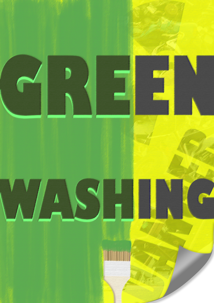
I continue developing the poster design to sit behind the illustration. I abandon the white blocks to help the text stand out past the green, and instead apply yellow, strongly representing hazardous danger over the top of the landfill image which serves more to add texture here. The paint brush is more directly linked to the painting, and I also add a page curl anticipating how it will serve to show that this backing image is a poster subject to greenwashing.
To bold text matches the green of the left side of the poster, and an unaffected grey on the right side of the poster past the green paint. To help the green text stand out, I duplicate the green portion of the text and place it behind in a bright green colour. This helps to improve readability even when heavily edited.
I adjusted the appearance of the poster overall with adjustments to the brightness and hue. I also apply a filter to the whole image to give the poster an aged, printed on paper texture. The filter slightly serves to blur it as well, to help an illustration over the top of it stand out.
I apply the edited ‘greenwashing’ poster to the background, not stretched out to the edge of the page as in my original plan. However I notice some issues with this approach immediately. The way the edge of the poster meets the ‘GDM’ name at the top, does make this mark slightly less clear and hinder readability. If one were to design a logo with brand specifications, it would be made clear that these design elements providing a background to the logo would be unacceptable.
It is also clear that adding the paintbrush to the poster does not make sense. The paintbrush is supposed to be an object which is being used in an act of greenwashing, so making it a part of the background design suggests that this is a poster about greenwashing rather than a poster which is actually subject to greenwashing. Some changes based on these reflections are necessary.
I remove some of the editing from the poster, just to experiment with the result of keeping the background and illustration seem more connected with quite flat textures.
An important change here is that the poster fills the entire background, after I identified the issue with the edge of the poster conflicting the ‘GDM’ wordmark. The uninterrupted green background does help the magazine name to remain clear.
I also have removed the page curl and concept that this is a physical poster in the world behind the illustration. The result, however, appears too flat and basic. Bringing back some of the complexities in editing is necessary.
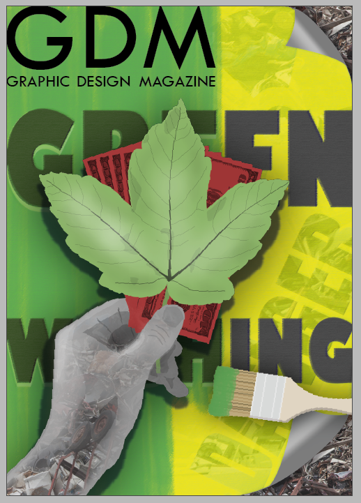
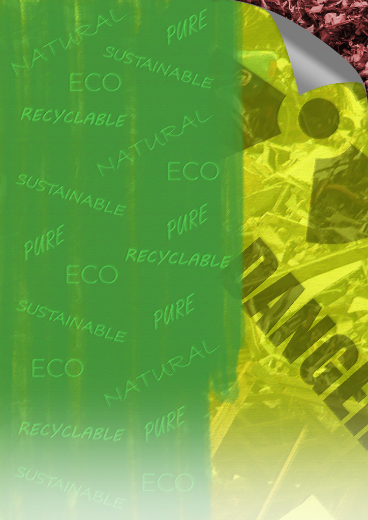
I apply a more edited background, along with page curls which expose the landfill pollution behind the poster. This helps to maintain some of the graphic design poster angle, whilst keeping the full page display of the background.
I add the paintbrush to the foreground alongside the illustration, rather than being a part of the background as it was previously. This makes sense to show the deliberate act of greenwashing, though the wording of ‘WASHING’ may be obscuring the paint as it meets the brush too much here.
I also applied a drop shadow and soft darkening outer glow to the foreground illustrations. This adds a mild sense of depth, though there certainly remains an overall flatness to the design – which may not be an issue considering many professional magazine covers had a simple flat design.
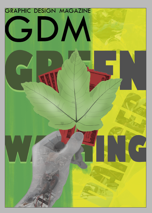
I had found with the previous experiments, that a major issue was the fact that the foreground illustration obscures the term ‘greenwashing’ too much. The illustration would have to be very small not to interrupt the readability of the word, which would limit its ability to draw attention to the cover. Another issue with how the wording was displayed, is that I had to separate the word ‘greenwashing’ into ‘green’ and ‘washing’ on separate lines. This could mislead audiences into thinking they truly are two separate words, which is not ideal for introducing the concept. And even with the words separate, the words still were not reliably readable behind the illustration as it was fully sized.
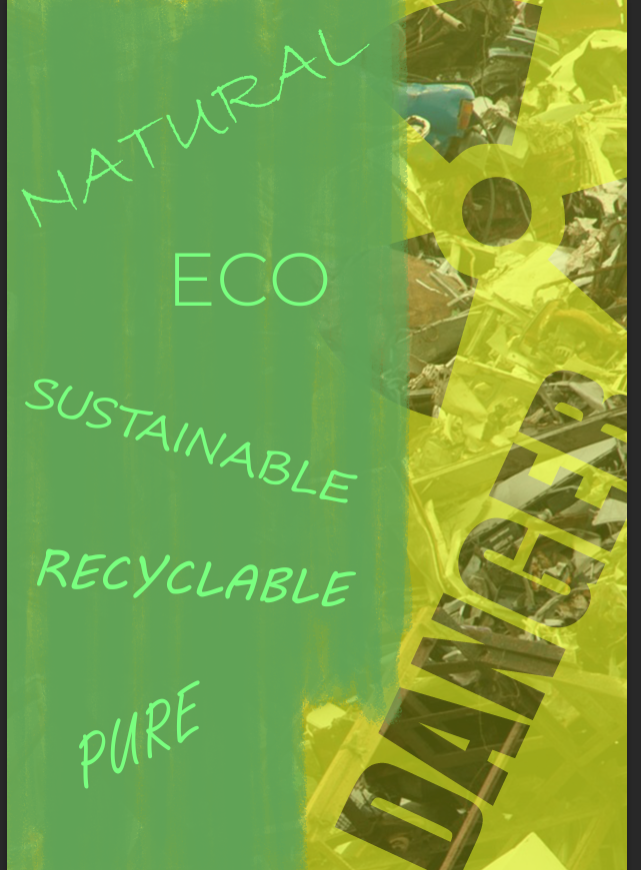
The concept for the background above, then removes the wording from the background and instead supports the greenwashing concept in a different way. I add some terms associated with the practice of greenwashing, in how companies use vague positive-sounding language to sell their products or services as green misleadingly. Light, mostly script style typefaces help it to seem like the text is a part of this deliberate greenwashing act.
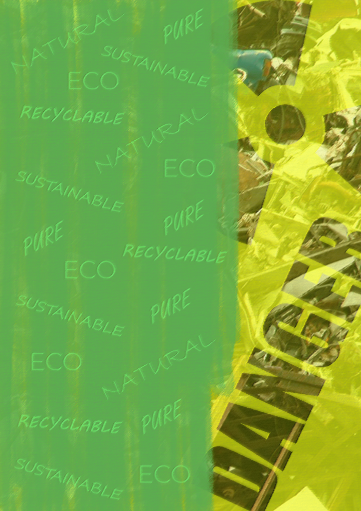
The words on the green side would have been too clear and distracting from the main text on the cover in the previously discussed image, so the following version shown above has the words repeated and decreased in size, and blended into the edited version of the background. They appear like a part of the paint, and can still be clearly read without standing out too much.
I applied the foreground illustrations to the new version of the background here. It is a certain improvement that the illustrations are no longer obstructing the view of the important ‘greenwashing’ name for the issue.
Instead I have applied the greenwashing title to the foreground, in the same style which changes from green to grey across the page in line with the divide between the green and yellow background. Having the word uninterrupted across one line is more appropriate with the intention to introduce audiences to the concept.
Another change is that I removed the page curl again, as I was concerned that there are too many visual elements competing for attention. I recognise, however, that this means that the concept of the background being a poster covering up pollution is less clear without the page curl, so the choice requires further consideration.
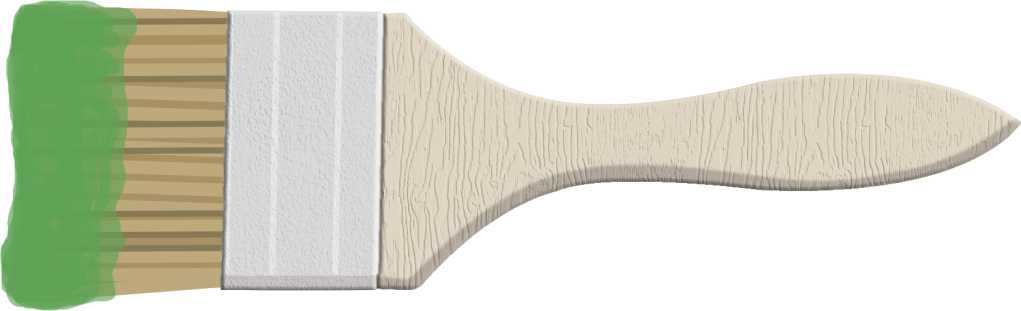
Focusing on the paint brush itself, I added some texture to the handle of it. The flat colour fill didn’t match well with the more detailed shading and textures of the rest of the front cover, so it is important to make the paint brush seem more like it belongs on the design. I also went back to the spreads to replace all instances of the paintbrush, with this textured version.
For the version above, I made the green section of the paint slightly darker so that it will be a slightly better contrast to the lighter green leaf. I refrained from making it any darker than it is above though, as I recall it needs to be enough of a contrast with the black ‘GDM’ magazine name. I also increased the contrast overall to help the words on the green, and the signs of danger on the right, stand out more for what they are included to communicate.
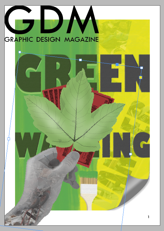
I re-added the page curl, just to the top-right corner. I found that it seemed like there was something missing from this part of the cover, since the top left area has the name of the magazine over the green, the yellow area at the top-right doesn’t seem to balance with it. The page curl helps to convey the concept of the front cover more effectively.

I made a few further changes for the version above. I moved the hand illustration out of the way of the bottom of the page. I found the hand illustration limited the power of the title text too much, as the darker and complex photographic element within the hand was a poor contrast for the dark title text. I still make sure that the tip of the leaf is in line with the ‘M’ of ‘GDM’, keeping the subject of greenwashing linked with the name.
Moving the illustration out of the way also gives more space to the paint brush to be more clearly seen to be linked to the paint effect on the background, opposite it with the same drop shadow effect. Moving the illustration out of the way exposes the clear divide in the background and plays into this as an element that divides the cover from top to bottom, taking better advantage of this choice in the background.
A soft faded white brush at the bottom of the page has significantly helped the ‘Greenwashing’ text to stand out with strong clarity, whilst not being a problem in covering up any part of the design.
Another key change is that the name of Graphic Design Magazine has been moved away from the edges of the page. Whilst the choice to push this right to the edge was inspired by some professional examples, I concede that the thin text (the full name ‘Graphic Design Magazine’ and not the ‘GDM’ acronym) could be obscured too much when printed if it stays at the edge. I recognise that in printing, the very edge of the design will start to wrap around to the spine, and the very top of the design would potentially get clipped off slightly more in printing. It is the safer choice to move this away from the edges, with the middle of the ‘M’ still marking the halfway mark on the page area.
This final version clearly displays the visual elements that it needs to. It uses well-established ways of communicating the concept of greenwashing, and utilises a bright yellow and green colouration to grab attention. It is appropriate in how it links to the design of the spreads that would be inside with the use of the same typeface at the top of the page, and the same paintbrush visual. This version should not be significantly changed for final submission, though further minor edits may be necessary.
